import pandas as pd
import matplotlib.pyplot as plt
from datetime import datetime
from statsmodels.tsa.stattools import grangercausalitytests
import pandas_datareader.data as web
import requests

from io import StringIO

start_date_str = '1979-01-01'
start_date = datetime.strptime(start_date_str,'%Y-%m-%d')
end_date = datetime.today()The Diminishing Returns of Education on Quality of Life: An Empirical Analysis of Macroeconomic Decoupling
Investigating the Causal Links Between M2 Monetary Expansion, Tuition Inflation, and the Erosion of Professional Career Stability
macro
economics
education policy
labor market
monetary policy
mental health
Abstract
This analysis challenges the traditional association between extended formal education and improved quality of life (QoL) by examining the structural breakdown of professional labor returns. Utilizing longitudinal data from 1979 to 2025, the study identifies a significant decoupling of real wages from productivity growth and a staggering disparity between tuition inflation and median income. Through Granger Causality tests, the research validates that expansions in the M2 money supply serve as a primary predictor for rising educational costs, effectively devaluing the net financial return of degrees. Furthermore, the application of a “Career Sharpe Ratio” framework reveals that higher education no longer functions as career insurance; rather, increased credentials often lead to higher income volatility that offsets marginal gains. The findings suggest a shift in the role of tertiary education from a tool for knowledge acquisition to a mechanism for “elite inclusion,” a transition that correlates with rising underemployment and a documented decline in the mental health and job satisfaction of highly educated professionals.
The Evolving Impact of Education on Quality of Life in the Context of M0/1/2/Consumer Inflation and Socioeconomic Shifts
This thesis explores the relationship between the length of formal education and overall quality of life (QoL), considering the evolving economic landscape influenced by M0/1/2/Consumer inflation. It hypothesizes that while extended education initially correlated with improved QoL through higher income, better employment, stable marriages, and overall well-being, lately, the benefits of prolonged education have diminished in the face of increasing economic pressures, competitive stress, and societal shifts. The study uses a combination of economic theory, quantitative data analysis, and sociological perspectives to examine how the changing cost-benefit dynamics of education affect life satisfaction in modern times.
Chapter 1: Introduction
Background
Education and Quality of Life: Historically, education has been seen as a key driver of social mobility and improved quality of life. Extended years in education have been associated with higher income, better job prospects, stable marriages, and improved health outcomes. M2 Inflation and Economic Environment: Over the past few decades, the global economic environment has been influenced by central banks’ monetary policies, including significant increases in M2 money supply. This has led to inflationary pressures, impacting the cost of education, living standards, and overall socioeconomic structures.
1.2 Research Problem
The traditional view that more education equates to better QoL is being challenged by new economic realities. Increasing costs of education, diminishing returns on educational investment, and changing societal expectations have altered the landscape.
1.3 Hypothesis
Up to a certain period, increased years of education correlated positively with improvements in QoL. However, as M0/1/2/Consumer inflation increased, leading to rising educational costs and altered economic dynamics, the benefits of prolonged education have diminished, even potentially reversing in certain cases.
Chapter 2: Quality of Life (QoL) Improvement Traditionally Associated with Years in Education
Long Years in Education, Job Stability and Income Mobility:
Income and Job Stability: Traditionally, longer years in education have been associated with higher income and better job stability. Research consistently shows that individuals with more education tend to earn more over their lifetimes and are less likely to be unemployed. This connection has been a key driver for the push towards extended education in many societies. No longer True.
Social Status and Mobility: Extended education has also been linked with higher social status and greater social mobility. The credentials obtained through prolonged education often serve as markers of social class, allowing individuals to access higher social and professional circles. No longer True.
Reducing Compensation Given a Productivity Level:
- Wage Stagnation: In recent decades, there has been growing concern that despite increasing levels of education, wages have not kept pace with productivity gains. This wage stagnation, coupled with rising education costs, has led to a situation where the financial returns on education may no longer justify the investment, thus reducing the perceived value of long-term education in improving QoL (World Bank).
- Underemployment: Many graduates find themselves in jobs that do not require the level of education they have attained, leading to underemployment. This mismatch between education and job requirements can contribute to dissatisfaction and frustration.
High Competitive Stress:
Mental Health Impacts: As the demand for higher education has increased, so has the competition, leading to significant stress among students. The pressure to perform well academically to secure top-tier jobs has contributed to a rise in mental health issues, including anxiety and depression. This competitive stress can negate some of the QoL improvements associated with higher education (World Bank).
Work-Life Imbalance: The need to excel in education often leads to work-life imbalances, where students and young professionals may sacrifice leisure and family time for academic or career success, potentially reducing overall life satisfaction.
Sedentary Lifestyles of Educated Individuals:
Health Implications: Higher levels of education are often associated with sedentary jobs, such as office work, which can lead to health issues like obesity, cardiovascular diseases, and mental health problems. The sedentary lifestyle that accompanies many highly educated professions may undermine the health benefits that should accompany better employment and income (Our World in Data).
Reduced Physical Activity: As people spend more time in education and subsequently in knowledge-intensive jobs, they may have less time for physical activities, which negatively impacts their overall well-being. T-leves for men.
High-Demand from Partners Selection (Female):
Marital Satisfaction and Selection Pressure: Educated individuals, especially women, may face higher expectations in partner selection, leading to delays in marriage or dissatisfaction due to mismatched expectations. The emphasis on finding a partner with similar educational or socioeconomic status can create additional stress and reduce life satisfaction (Our World in Data).
Family Dynamics: Higher education levels can lead to different expectations in family roles, potentially causing conflicts or dissatisfaction within marriages, especially if traditional roles are challenged.
Inability to Go Back to Do Business Perceived as “Lower Socioeconomic”:
Entrepreneurial Barriers: Educated individuals may feel trapped in their career paths, unable to pivot to entrepreneurship or other non-traditional roles without risking social stigma. This perception of certain businesses as “lower socioeconomic” can prevent them from pursuing potentially fulfilling and profitable ventures (World Bank).
Risk Aversion: Higher education often leads to risk aversion, where individuals prefer the stability of employment over the uncertainties of starting a business. This conservative approach can limit their opportunities for significant QoL improvements through entrepreneurship.
Servitude of Service Jobs Taken by Educated Individuals:
Job Dissatisfaction: Many graduates find themselves in service-oriented jobs that may not align with their education or career aspirations. The servitude nature of these jobs, coupled with the disconnect from their education, can lead to job dissatisfaction and lower life satisfaction.
Economic Pressure: The necessity to repay student loans and meet living expenses often forces educated individuals into jobs that do not utilize their full potential, leading to feelings of underachievement and frustration.
Reducing Chances of Entrepreneurship:
Socioeconomic Barriers: Entrepreneurship increasingly appears to be dominated by individuals with access to significant capital, often from affluent backgrounds. This reduces the chances for those from less privileged backgrounds, even if they are highly educated, to pursue entrepreneurial opportunities (World Bank).
VC and Networking Challenges: Access to venture capital and entrepreneurial networks is often limited to those with the right connections or backgrounds, making it difficult for highly educated individuals without these advantages to succeed in starting their own businesses.
Realization of Index Investing (e.g., SPY) for QoL Satisfaction:
Financial Independence: As individuals realize the time and stress associated with traditional employment, many are turning to passive investing strategies, such as investing in index funds (e.g., SPY), to achieve financial independence and improve QoL. This shift reflects a growing understanding that financial security can be achieved through means other than prolonged education and employment (World Bank).
Shift in Priorities: The realization that passive income (and/or wealth creation) from investments can provide a more stable and less stressful life has led many to question the traditional emphasis on education as the primary path to a better QoL.
Education for Inclusion in “Cosy Clubs” Rather Than Knowledge:
Networking and Social Capital: Increasingly, education is seen as a means to gain entry into exclusive professional networks (e.g., MBA, IB, VC, PE) rather than purely for knowledge acquisition. This shift has implications for QoL, as the primary value of education becomes social capital rather than personal or intellectual development (Our World in Data).
Decline in Knowledge-Based QoL: As access to knowledge becomes more democratized through the internet, the direct impact of education on QoL through knowledge acquisition has diminished. The focus on networking rather than knowledge challenges the traditional notion of education as a means to improve QoL through intellectual growth.
1. Long Years in Education, Job Stability and Income Mobility:
Traditionally, more years in education have been strongly associated with higher income and better job stability. However, several factors, including M0/1/2/Consumer inflation and technological disruption, have weakened this association in recent years.
Career Sharpe Ratio — Formal Definition
Expected real earnings
\[ E_t = \frac{W_t}{P_t / 100} \cdot (1 - u_t) \]
where:
\[ \begin{aligned} W_t & = \text{nominal median earnings at time } t \\ P_t & = \text{price level (CPI index, base } 100) \\ u_t & = \text{unemployment rate at time } t \end{aligned} \]
Career return (growth)
\[ r_t = \ln(E_t) - \ln(E_{t-1}) \]
Career Sharpe Ratio
Let:
\[ \mu_r = \mathbb{E}[r_t] \]
\[ \sigma_r = \sqrt{\mathbb{V}[r_t]} \]
Let ( k ) denote the number of periods per year (e.g., ( k = 4 ) for quarterly data).
\[ \text{CareerSharpe} = \frac{k \, \mu_r}{\sqrt{k} \, \sigma_r} \]
or equivalently,
\[ \text{CareerSharpe} = \frac{\mathbb{E}[r_t]}{\sqrt{\mathbb{V}[r_t]}} \cdot \sqrt{k} \]
Interpretation
\[ \text{CareerSharpe} > 0 \;\Rightarrow\; \text{growth dominates volatility (stable career)} \]
\[ \text{CareerSharpe} = 0 \;\Rightarrow\; \text{growth equals instability} \]
\[ \text{CareerSharpe} < 0 \;\Rightarrow\; \text{volatility dominates growth (fragile career)} \]
Individual-level extension
\[ \text{CareerSharpe}_i = \frac{\mathbb{E}[r_{i,t}]}{\sqrt{\mathbb{V}[r_{i,t}]}} \cdot \sqrt{k} \]
EARNING_FRED_SERIES = {
    # ------------------------------------------------------------------
    # Median usual weekly nominal earnings
    # Full-time wage & salary workers, age 25+
    # Quarterly
    # ------------------------------------------------------------------
    "earn_lt_hs_q": "LEU0252920700Q",   # Less than HS diploma, 25+
    "earn_hs_q":    "LEU0252917300Q",   # HS graduates, no college, 25+
    "earn_some_q":  "LEU0254929400Q",   # Some college or associate degree, 25+
    "earn_ba_q":    "LEU0252919100Q",   # Bachelor's degree only, 25+
    "earn_adv_q":   "LEU0252919700Q",   # Advanced degree, 25+

    # ------------------------------------------------------------------
    # Unemployment rates
    # Age 25+, monthly, seasonally adjusted
    # ------------------------------------------------------------------
    "unemp_lt_hs_m": "LNS14027659",     # Less than HS, 25+
    "unemp_hs_m":    "LNS14027660",     # HS graduates, no college, 25+
    "unemp_some_m":  "LNS14027689",     # Some college or associate degree, 25+
    "unemp_ba_m":    "CGRA2024",        # Bachelor's degree, 25+
    "unemp_adv_m":   "ADVRA25",         # Advanced degree (Master's+), 25+

    # ------------------------------------------------------------------
    # Inflation
    # ------------------------------------------------------------------
    "cpi_m": "CPIAUCSL",                # CPI-U, monthly, seasonally adjusted
}
import numpy as np
import pandas as pd
from pandas_datareader import data as pdr
def fetch_fred(series_id: str, start="2000-01-01"):
s = pdr.DataReader(series_id, "fred", start=start)
s.columns = [series_id]
return s
def annualized_sharpe(log_returns: pd.Series, periods_per_year=4) -> float:
lr = log_returns.dropna()
if len(lr) < 8:
return np.nan
mu = lr.mean() * periods_per_year
sig = lr.std(ddof=1) * np.sqrt(periods_per_year)
return float(mu / sig) if sig > 0 else np.nan
def to_quarterly_period_mean(monthly: pd.Series) -> pd.Series:
"""
Convert a monthly DatetimeIndex series to quarterly series indexed by PeriodIndex('Q'),
using mean within quarter.
"""
q = monthly.copy()
q.index = q.index.to_period("Q")
return q.groupby(level=0).mean()
def to_quarterly_period_last(monthly: pd.Series) -> pd.Series:
"""
Sometimes you may prefer end-of-quarter value instead of mean.
"""
q = monthly.copy()
q.index = q.index.to_period("Q")
return q.groupby(level=0).last()
def to_quarterly_period_from_quarterly(quarterly: pd.Series) -> pd.Series:
"""
Convert quarterly DatetimeIndex (often quarter-start dates on FRED) to PeriodIndex('Q').
"""
q = quarterly.copy()
q.index = q.index.to_period("Q")
return q
def career_sharpe_for_group_period(
earn_q: pd.Series, # quarterly earnings (nominal weekly)
unemp_m: pd.Series, # monthly unemployment rate in %
cpi_m: pd.Series, # monthly CPI index
use_cpi_mean=True,
use_unemp_mean=True,
) -> pd.DataFrame:
# --- Convert to quarterly PeriodIndex('Q') ---
earn_qp = to_quarterly_period_from_quarterly(earn_q)
unemp_qp = to_quarterly_period_mean(unemp_m) if use_unemp_mean else to_quarterly_period_last(unemp_m)
unemp_qp = unemp_qp / 100.0 # % -> fraction
cpi_qp = to_quarterly_period_mean(cpi_m) if use_cpi_mean else to_quarterly_period_last(cpi_m)
# --- Align on common quarters ---
idx = earn_qp.dropna().index.intersection(unemp_qp.dropna().index).intersection(cpi_qp.dropna().index)
earn_qp = earn_qp.loc[idx]
unemp_qp = unemp_qp.loc[idx]
cpi_qp = cpi_qp.loc[idx]
# --- Compute proxy expected real earnings ---
real_weekly = earn_qp / (cpi_qp / 100.0)
expected_real_weekly = real_weekly * (1.0 - unemp_qp)
# Quarterly log returns
r = np.log(expected_real_weekly).diff()
out = pd.DataFrame({
"earn_nominal_weekly": earn_qp,
"cpi": cpi_qp,
"unemp_rate": unemp_qp,
"real_weekly": real_weekly,
"expected_real_weekly": expected_real_weekly,
"log_return_qoq": r,
})
out.attrs["career_sharpe"] = annualized_sharpe(out["log_return_qoq"])
return out
def run_all_fred_series_for_career_sharpe(FRED_SERIES, start="2000-01-01"):
earnings = {
"lt_hs": fetch_fred(FRED_SERIES["earn_lt_hs_q"], start).iloc[:, 0],
"hs": fetch_fred(FRED_SERIES["earn_hs_q"], start).iloc[:, 0],
"some": fetch_fred(FRED_SERIES["earn_some_q"], start).iloc[:, 0],
"ba": fetch_fred(FRED_SERIES["earn_ba_q"], start).iloc[:, 0],
"adv": fetch_fred(FRED_SERIES["earn_adv_q"], start).iloc[:, 0],
}
unemp = {
"lt_hs": fetch_fred(FRED_SERIES["unemp_lt_hs_m"], start).iloc[:, 0],
"hs": fetch_fred(FRED_SERIES["unemp_hs_m"], start).iloc[:, 0],
"some": fetch_fred(FRED_SERIES["unemp_some_m"], start).iloc[:, 0],
"ba": fetch_fred(FRED_SERIES["unemp_ba_m"], start).iloc[:, 0],
}
cpi = fetch_fred(FRED_SERIES["cpi_m"], start).iloc[:, 0]
# Advanced-degree unemployment fallback
try:
unemp["adv"] = fetch_fred(FRED_SERIES["unemp_adv_m"], start).iloc[:, 0]
except Exception:
unemp["adv"] = fetch_fred("LNS14027662", start).iloc[:, 0]
results = {}
rows = []
for k in ["lt_hs", "hs", "some", "ba", "adv"]:
df = career_sharpe_for_group_period(
earn_q=earnings[k],
unemp_m=unemp[k],
cpi_m=cpi,
use_cpi_mean=True,
use_unemp_mean=True,
)
results[k] = df
lr = df["log_return_qoq"].dropna()
rows.append({
"education_group": k,
"career_sharpe": df.attrs["career_sharpe"],
"start_q": str(df.index.min()) if not df.empty else None,
"end_q": str(df.index.max()) if not df.empty else None,
"n_quarters": int(lr.shape[0]),
})
sharpe_table = pd.DataFrame(rows).sort_values("career_sharpe", ascending=False)
return sharpe_table, resultssharpe_table, results = run_all_fred_series_for_career_sharpe(EARNING_FRED_SERIES, start=start_date_str)
print(sharpe_table.to_string(index=False))education_group career_sharpe start_q end_q n_quarters
adv 0.026205 2000Q1 2025Q3 102
lt_hs 0.024898 2000Q1 2025Q3 102
hs 0.017300 2000Q1 2025Q3 102
some -0.026485 2000Q1 2025Q3 102
ba -0.031516 2000Q1 2025Q3 102results["ba"].tail()| earn_nominal_weekly | cpi | unemp_rate | real_weekly | expected_real_weekly | log_return_qoq | |
|---|---|---|---|---|---|---|
| DATE | ||||||
| 2024Q3 | 1533 | 314.182667 | 0.082667 | 487.932710 | 447.596939 | -0.030950 |
| 2024Q4 | 1547 | 316.538667 | 0.056667 | 488.723863 | 461.029511 | 0.029569 |
| 2025Q1 | 1603 | 319.492000 | 0.064667 | 501.734003 | 469.288537 | 0.017756 |
| 2025Q2 | 1559 | 320.800333 | 0.057667 | 485.972064 | 457.947675 | -0.024463 |
| 2025Q3 | 1580 | 323.288000 | 0.091333 | 488.728317 | 444.091130 | -0.030725 |
EDU_YEARS_MAP = {
    "lt_hs": 10,
    "hs":    12,
    "some":  14,
    "ba":    16,
    "adv":   18,
}

def rolling_career_sharpe_series(df, window=20, periods_per_year=4):
    """
    Rolling Career Sharpe from a group's df (must contain log_return_qoq).
    Annualized mean / annualized std with quarterly periods.
    """
    r = df["log_return_qoq"]

    mu = r.rolling(window).mean() * periods_per_year
    sig = r.rolling(window).std(ddof=1) * np.sqrt(periods_per_year)

    return mu / sig
def plot_stacked_rolling_career_sharpe_semantic(results, window=20):
"""
Fixed semantic order (education ladder), with higher education closer to the zero line.
Uses consistent colors for the same group above and below zero.
"""
# --- Fixed semantic order (higher ed near zero) ---
groups = ["adv", "ba", "some", "hs", "lt_hs"] # fixed ladder order
# ---- Build aligned DataFrame of rolling Sharpe ----
sharpe_series = []
for k in groups:
df = results.get(k)
if df is None or df.empty:
continue
mu = df["log_return_qoq"].rolling(window).mean() * 4
sig = df["log_return_qoq"].rolling(window).std() * np.sqrt(4)
sharpe_series.append((mu / sig).rename(k))
sharpe_df = pd.concat(sharpe_series, axis=1).dropna(how="all")
sharpe_df.index = sharpe_df.index.to_timestamp()
# Ensure all groups exist & order is preserved
groups_present = [g for g in groups if g in sharpe_df.columns]
sharpe_df = sharpe_df[groups_present]
# ---- Split into positive and negative parts ----
pos = sharpe_df.clip(lower=0)
neg = sharpe_df.clip(upper=0)
# ---- Consistent colors per group ----
cmap = plt.get_cmap("tab10")
color_map = {g: cmap(i % 10) for i, g in enumerate(groups_present)}
colors = [color_map[g] for g in groups_present]
# ---- Plot ----
plt.figure(figsize=(13, 6))
# Positive stack
plt.stackplot(
pos.index,
[pos[g].values for g in groups_present],
labels=groups_present,
colors=colors,
alpha=1.0
)
# Negative stack (same order, same colors)
plt.stackplot(
neg.index,
[neg[g].values for g in groups_present],
colors=colors,
alpha=1.0
)
plt.axhline(0, color="black", lw=1)
plt.title(f"Stacked Rolling Career Sharpe by Education Group ({window}Q window)")
plt.ylabel("Career Sharpe (risk-adjusted stability)")
plt.xlabel("Year")
plt.legend(loc="upper left", title="Education group", ncol=2)
plt.grid(alpha=0.3)
plt.tight_layout()
plt.show()
# Usage:
plot_stacked_rolling_career_sharpe_semantic(results, window=20)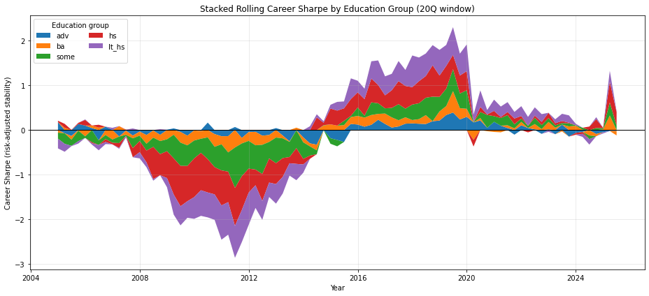
def plot_sharpe_vs_edu_at_sample_ends(results, edu_years_map, window=20):
    """
    Two-row plot (shared X axis: years of education):
      Row 1: Sharpe at earliest available date (first non-NaN rolling value per group)
      Row 2: Sharpe at latest available date (last rolling value per group)
    """

    rows_early = []
    rows_late = []

    for group, df in results.items():
        if df is None or df.empty or group not in edu_years_map:
            continue

        s = rolling_career_sharpe_series(df, window=window).dropna()
        if s.empty:
            continue

        years = edu_years_map[group]

        # Earliest defined rolling Sharpe (after window)
        early_date = s.index[0]
        early_val  = float(s.iloc[0])

        # Latest rolling Sharpe (end of sample)
        late_date = s.index[-1]
        late_val  = float(s.iloc[-1])

        rows_early.append({
            "group": group,
            "years_education": years,
            "career_sharpe": early_val,
            "date": early_date
        })

        rows_late.append({
            "group": group,
            "years_education": years,
            "career_sharpe": late_val,
            "date": late_date
        })

    df_early = pd.DataFrame(rows_early).sort_values("years_education")
    df_late  = pd.DataFrame(rows_late).sort_values("years_education")

    # If you want the "early" and "late" dates to be common across groups,
    # you can display the range here:
    early_dates = df_early["date"].tolist()
    late_dates  = df_late["date"].tolist()

    fig, axes = plt.subplots(nrows=2, ncols=1, figsize=(9, 8), sharex=True)

    # ---- Row 1: earliest ----
    axes[0].plot(df_early["years_education"], df_early["career_sharpe"], marker="o")
    axes[0].axhline(0, color="black", lw=1)
    axes[0].set_title(
        f"Career Sharpe vs Years of Education (Earliest available rolling value, window={window}Q)\n"
        f"Dates shown vary by group; earliest among them: {min(early_dates)}"
    )
    axes[0].set_ylabel("Career Sharpe")
    axes[0].grid(alpha=0.3)
    for _, r in df_early.iterrows():
        axes[0].annotate(r["group"], (r["years_education"], r["career_sharpe"]),
                         textcoords="offset points", xytext=(6, 6), fontsize=9)

    # ---- Row 2: latest ----
    axes[1].plot(df_late["years_education"], df_late["career_sharpe"], marker="o")
    axes[1].axhline(0, color="black", lw=1)
    axes[1].set_title(
        f"Career Sharpe vs Years of Education (Latest rolling value, window={window}Q)\n"
        f"Latest among them: {max(late_dates)}"
    )
    axes[1].set_ylabel("Career Sharpe")
    axes[1].set_xlabel("Years of education")
    axes[1].grid(alpha=0.3)
    for _, r in df_late.iterrows():
        axes[1].annotate(r["group"], (r["years_education"], r["career_sharpe"]),
                         textcoords="offset points", xytext=(6, 6), fontsize=9)

    plt.tight_layout()
    plt.show()

    return df_early, df_late


# Usage:
df_early, df_late = plot_sharpe_vs_edu_at_sample_ends(results, EDU_YEARS_MAP, window=20)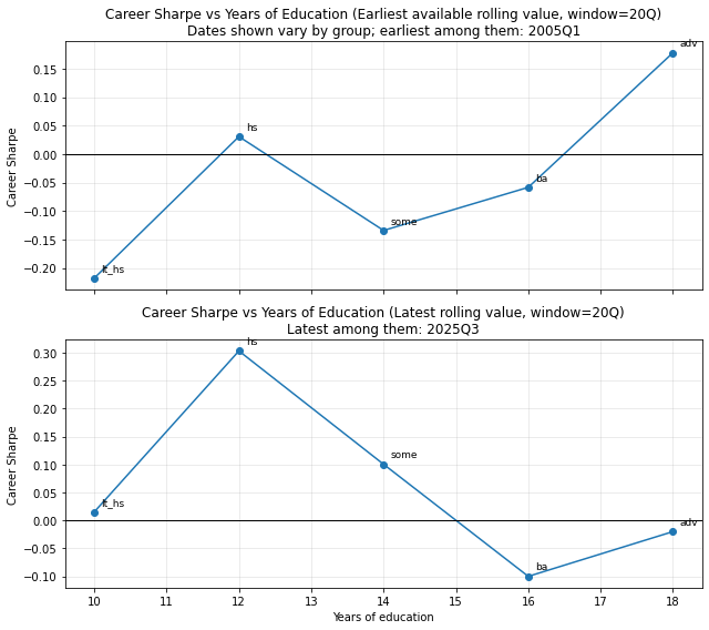
import numpy as np
import pandas as pd
import matplotlib.pyplot as plt
import matplotlib.colors as mcolors
from pandas_datareader import data as pdr

def fetch_us_recessions(start="1990-01-01"):
    """
    Fetch US recession indicator (USREC) from FRED.
    1 = recession, 0 = expansion.
    """
    rec = pdr.DataReader("USREC", "fred", start)
    rec.index = pd.to_datetime(rec.index)
    return rec

def recession_intervals(usrec: pd.DataFrame):
    """
    Convert monthly USREC series into a list of (start, end) timestamps.
    """
    rec = usrec["USREC"]
    intervals = []

    in_rec = False
    start = None

    for date, val in rec.items():
        if val == 1 and not in_rec:
            start = date
            in_rec = True
        elif val == 0 and in_rec:
            intervals.append((start, date))
            in_rec = False

    if in_rec:
        intervals.append((start, rec.index[-1]))

    return intervals

def plot_edu_sharpe_heatmap_with_recessions(
    results,
    edu_years_map,
    window=20,
    rec_start="1990-01-01"
):
    # ---- Build panel (same as before) ----
    panel = build_edu_sharpe_panel(results, edu_years_map, window=window)

    Z = np.ma.masked_invalid(panel.T.values)
    years = panel.columns.values
    times = panel.index.values

    # ---- Zero-centered normalization ----
    vmax = np.nanmax(np.abs(Z))
    norm = mcolors.TwoSlopeNorm(vmin=-vmax, vcenter=0.0, vmax=vmax)

    # ---- Fetch recessions ----
    usrec = fetch_us_recessions(start=rec_start)
    rec_intervals = recession_intervals(usrec)

    # ---- Plot ----
    plt.figure(figsize=(14, 5))

    plt.imshow(
        Z,
        aspect="auto",
        origin="lower",
        interpolation="nearest",
        cmap="RdYlGn",
        norm=norm,
        extent=[0, len(times) - 1, years.min(), years.max()]
    )

    # X ticks (years)
    n_xticks = min(10, len(times))
    xtick_pos = np.linspace(0, len(times) - 1, n_xticks).astype(int)
    xtick_lbl = [pd.to_datetime(times[i]).strftime("%Y") for i in xtick_pos]
    plt.xticks(xtick_pos, xtick_lbl)

    # Y ticks (education years)
    plt.yticks(years, [str(int(y)) for y in years])

    # ---- Overlay recession bands ----
    time_index = pd.to_datetime(times)

    for start, end in rec_intervals:
        # find indices overlapping the heatmap time range
        if end < time_index.min() or start > time_index.max():
            continue

        x0 = np.searchsorted(time_index, start, side="left")
        x1 = np.searchsorted(time_index, end, side="right")

        plt.axvspan(
            x0, x1,
            color="black",
            alpha=0.3,   # subtle but visible
            lw=0
        )

    cbar = plt.colorbar()
    cbar.set_label("Rolling Career Sharpe")

    plt.title(
        f"Education–Career Sharpe Surface with US Recessions\n"
        f"Rolling window = {window} quarters"
    )
    plt.xlabel("Year")
    plt.ylabel("Years of education")

    plt.tight_layout()
    plt.show()

    return panel

plot_edu_sharpe_heatmap_with_recessions(
    results,
    EDU_YEARS_MAP,
    window=20,
    rec_start="1990-01-01"
)
| 10 | 12 | 14 | 16 | 18 | |
|---|---|---|---|---|---|
| DATE | |||||
| 2005-01-01 | -0.217867 | 0.030670 | -0.134112 | -0.058386 | 0.177880 |
| 2005-04-01 | -0.176164 | 0.088045 | -0.236736 | 0.051427 | -0.072408 |
| 2005-07-01 | -0.007828 | 0.005134 | -0.137005 | -0.082290 | -0.133007 |
| 2005-10-01 | -0.054053 | 0.026606 | -0.236067 | -0.012380 | 0.135676 |
| 2006-01-01 | 0.011318 | 0.126577 | -0.034653 | -0.141063 | 0.101021 |
| ... | ... | ... | ... | ... | ... |
| 2024-07-01 | -0.122012 | 0.078718 | -0.081831 | -0.117491 | -0.003857 |
| 2024-10-01 | 0.044885 | 0.197410 | 0.045686 | -0.050311 | -0.087999 |
| 2025-01-01 | -0.026605 | 0.008222 | 0.026629 | 0.015947 | -0.048712 |
| 2025-04-01 | 0.243602 | 0.465019 | 0.290055 | 0.326661 | -0.021351 |
| 2025-07-01 | 0.015073 | 0.303110 | 0.100364 | -0.100123 | -0.020048 |
83 rows × 5 columns
Observation from the chart
Education =/= insurance anymore
Higher education:
- Raises mean income
- Raises volatility more
- Lowers Career Sharpe
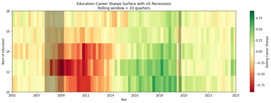
Across 2000–2025, risk-adjusted career outcomes in the US show no monotonic relationship with years of education; instead, education cohorts move together across macro regimes, with mid-to-upper education levels exhibiting the greatest downside during shocks and no group offering persistent career stability.
It’s Inflation !
2. Reducing Compensation Given a Productivity Level
M0/1/2 Inflation and Real Wages: The increase in M2 money supply has contributed to inflation, which in turn has eroded the purchasing power of wages. While nominal wages might rise, real wages—adjusted for inflation—have stagnated or even declined for many workers, particularly those in jobs traditionally associated with higher education.
Data Evidence: Studies such as those from the Federal Reserve Bank of St. Louis have shown that while M2 has increased significantly, the growth in real wages has not kept pace, particularly after the 2008 financial crisis (St. Louis Fed).
Example: The Economic Policy Institute found that between 1979 and 2020, the median worker’s wages grew by only 15.1% when adjusted for inflation, while productivity increased by 61.8%. This decoupling suggests that higher education does not necessarily lead to proportionate income growth in an inflationary environment.
Download Productivity data
headers = {
    "User-Agent": "Mozilla/5.0 (Macintosh; Intel Mac OS X 10_15_7) AppleWebKit/537.36 (KHTML, like Gecko) Chrome/127.0.0.0 Safari/537.36"
}
productivity_url = "https://download.bls.gov/pub/time.series/pr/pr.data.1.AllData"

data = requests.get(productivity_url, headers=headers).text

productivity_data = pd.read_csv(StringIO(data), sep="\t")
productivity_data.columns = ['series_id', 'year', 'period', 'value','footnote_codes']
productivity_data['series_id'] = productivity_data['series_id'].str.strip()
productivity_data['period'] = productivity_data['period'].str.strip()
#productivity_data.info()

# Step 2: Process the productivity data
# Filtering for relevant data (example uses a hypothetical series code PRS85006093 for nonfarm business productivity)
productivity_data = productivity_data[(productivity_data['series_id'] == 'PRS85006093') & (productivity_data['year'] >= start_date.year)]
productivity_data = productivity_data[['year', 'value']].rename(columns={'value': 'Productivity_Index'})

productivity_data.head()| year | Productivity_Index | |
|---|---|---|
| 45473 | 1979 | 49.615 |
| 45474 | 1979 | 49.523 |
| 45475 | 1979 | 49.463 |
| 45476 | 1979 | 49.405 |
| 45477 | 1979 | 49.360 |
Download Median Wage Data
import pandas_datareader as pdr
from datetime import datetime

# LEU0252881600Q: Median usual weekly real earnings: Wage and salary workers: 16 years and over
wage_data = pdr.get_data_fred('LEU0252881600Q', start=datetime(1979, 1, 1), end=datetime(2020, 12, 31))

# Preview the data
wage_data = wage_data.groupby(wage_data.index.year)["LEU0252881600Q"].median()

wage_data = wage_data.reset_index()

# Step 3: Process the wage data
# Assuming the data is already in the right format
wage_data = wage_data[wage_data['DATE'] >= 1979]
wage_data = wage_data[['DATE', 'LEU0252881600Q']].rename(columns={'DATE':'year', 'LEU0252881600Q': 'Weekly_Median_Wage'})
wage_data.head()| year | Weekly_Median_Wage | |
|---|---|---|
| 0 | 1979 | 331.0 |
| 1 | 1980 | 316.0 |
| 2 | 1981 | 312.5 |
| 3 | 1982 | 314.5 |
| 4 | 1983 | 314.0 |
# Step 4: Merge the datasets on the year
merged_data = pd.merge(productivity_data, wage_data, left_on='year', right_on='year')
merged_data.head()| year | Productivity_Index | Weekly_Median_Wage | |
|---|---|---|---|
| 0 | 1979 | 49.615 | 331.0 |
| 1 | 1979 | 49.523 | 331.0 |
| 2 | 1979 | 49.463 | 331.0 |
| 3 | 1979 | 49.405 | 331.0 |
| 4 | 1979 | 49.360 | 331.0 |
# Step 5: Calculate cumulative growth
base_productivity = merged_data['Productivity_Index'].iloc[0]
base_wage = merged_data['Weekly_Median_Wage'].iloc[0]

merged_data['Productivity_Growth'] = ((merged_data['Productivity_Index'] - base_productivity) / base_productivity) * 100
merged_data['Weekly_Median_Wage_Growth'] = ((merged_data['Weekly_Median_Wage'] - base_wage) / base_wage) * 100

# Step 6: Plot the data
plt.figure(figsize=(10, 6))
plt.plot(merged_data['year'], merged_data['Productivity_Growth'], label='Productivity Growth')
plt.plot(merged_data['year'], merged_data['Weekly_Median_Wage_Growth'], label='Weekly Median Wage Growth')
plt.title('Productivity Growth vs. Weekly Median Wage Growth (1979-2020)')
plt.xlabel('Year')
plt.ylabel('Cumulative Growth (%)')
plt.legend()
plt.grid(True)
plt.show()

# Display the final growth rates
print(f"Productivity Growth (1979-2020): {merged_data['Productivity_Growth'].iloc[-1]:.2f}%")
print(f"Weekly Median Wage Growth (1979-2020): {merged_data['Weekly_Median_Wage_Growth'].iloc[-1]:.2f}%")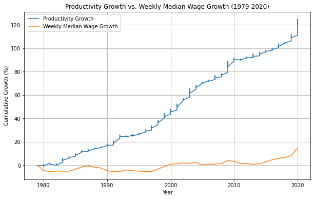
Productivity Growth (1979-2020): 120.07%
Weekly Median Wage Growth (1979-2020): 14.95%
Impact of M2 Inflation: Rising Costs of Living and Education
Education Costs: The cost of education has risen significantly, outpacing inflation and wage growth. As M2 inflation contributes to the overall increase in the cost of living, students graduate with higher levels of debt, which diminishes the net financial returns of their education.
Case Study: According to the College Board, the average cost of tuition and fees at private four-year institutions in the U.S. has more than doubled since 2000, while wages have not kept pace with these increases
Data Source: https://research.collegeboard.org/media/xlsx/trends-college-pricing-excel-data-2023.xlsx
tution_data = pd.read_csv("data/tuition_private_4yr_current_dollars_final_cleaned.csv")
tution_data.columns = ['year', 'Private_Nonprofit_Four_Year']
tution_data.head()| year | Private_Nonprofit_Four_Year | |
|---|---|---|
| 0 | 1971 | 1830.0 |
| 1 | 1972 | 1950.0 |
| 2 | 1973 | 2050.0 |
| 3 | 1974 | 2130.0 |
| 4 | 1975 | 2290.0 |
# Step 4: Merge the datasets on the year
merged_data = pd.merge(tution_data, wage_data, left_on='year', right_on='year')
merged_data.head()| year | Private_Nonprofit_Four_Year | Weekly_Median_Wage | |
|---|---|---|---|
| 0 | 1979 | 3230.0 | 331.0 |
| 1 | 1980 | 3620.0 | 316.0 |
| 2 | 1981 | 4110.0 | 312.5 |
| 3 | 1982 | 4640.0 | 314.5 |
| 4 | 1983 | 5090.0 | 314.0 |
# Step 5: Calculate cumulative growth
base_tution = merged_data['Private_Nonprofit_Four_Year'].iloc[0]
base_wage = merged_data['Weekly_Median_Wage'].iloc[0]

merged_data['Tution_Growth'] = ((merged_data['Private_Nonprofit_Four_Year'] - base_tution) / base_tution) * 100
merged_data['Weekly_Median_Wage_Growth'] = ((merged_data['Weekly_Median_Wage'] - base_wage) / base_wage) * 100

# Step 6: Plot the data
plt.figure(figsize=(10, 6))
plt.plot(merged_data['year'], merged_data['Tution_Growth'], label='Tution Growth (Private Nonprofit Four Year)')
plt.plot(merged_data['year'], merged_data['Weekly_Median_Wage_Growth'], label='Weekly Median Wage Growth')
plt.title('Tution Growth (Private Nonprofit Four Year) vs. Weekly Median Wage Growth (1979-2020)')
plt.xlabel('Year')
plt.ylabel('Cumulative Growth (%)')
plt.legend()
plt.grid(True)
plt.show()

# Display the final growth rates
print(f"Tution Growth (Private Nonprofit Four Year) (1979-): {merged_data['Tution_Growth'].iloc[-1]:.2f}%")
print(f"Weekly Median Wage Growth (1979-): {merged_data['Weekly_Median_Wage_Growth'].iloc[-1]:.2f}%")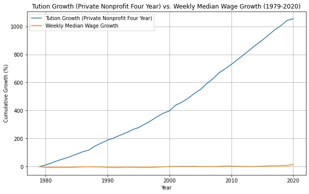
Tution Growth (Private Nonprofit Four Year) (1979-): 1053.87%
Weekly Median Wage Growth (1979-): 14.95%
Now let’s explore how Tution Growth and M2 Inflation are related.
Tution Growth and M2 Inflation
# Fetch M2 Money Stock data
m2_supply = web.DataReader('M2SL', 'fred', start_date, end_date)

m2_supply = m2_supply.groupby(m2_supply.index.year)["M2SL"].mean()
m2_supply.dropna()

m2_supply = pd.DataFrame(data={
    'year': m2_supply.index,
    'm2sl': m2_supply.values
})
m2_supply.reset_index()
m2_supply.head(5)| year | m2sl | |
|---|---|---|
| 0 | 1979 | 1425.666667 |
| 1 | 1980 | 1540.183333 |
| 2 | 1981 | 1679.291667 |
| 3 | 1982 | 1830.925000 |
| 4 | 1983 | 2054.466667 |
tution_m2sl_merged_data = pd.merge(tution_data, m2_supply, left_on='year', right_on='year')
tution_m2sl_merged_data.head()| year | Private_Nonprofit_Four_Year | m2sl | |
|---|---|---|---|
| 0 | 1979 | 3230.0 | 1425.666667 |
| 1 | 1980 | 3620.0 | 1540.183333 |
| 2 | 1981 | 4110.0 | 1679.291667 |
| 3 | 1982 | 4640.0 | 1830.925000 |
| 4 | 1983 | 5090.0 | 2054.466667 |
# Perform Granger Causality Test
granger_test = grangercausalitytests(tution_m2sl_merged_data[['Private_Nonprofit_Four_Year', 'm2sl']],
                                     maxlag=12,
                                     verbose=True)
Granger Causality
number of lags (no zero) 1
ssr based F test:         F=0.0591  , p=0.8092  , df_denom=41, df_num=1
ssr based chi2 test:   chi2=0.0634  , p=0.8012  , df=1
likelihood ratio test: chi2=0.0634  , p=0.8013  , df=1
parameter F test:         F=0.0591  , p=0.8092  , df_denom=41, df_num=1

Granger Causality
number of lags (no zero) 2
ssr based F test:         F=0.2816  , p=0.7561  , df_denom=38, df_num=2
ssr based chi2 test:   chi2=0.6373  , p=0.7271  , df=2
likelihood ratio test: chi2=0.6327  , p=0.7288  , df=2
parameter F test:         F=0.2816  , p=0.7561  , df_denom=38, df_num=2

Granger Causality
number of lags (no zero) 3
ssr based F test:         F=11.8657 , p=0.0000  , df_denom=35, df_num=3
ssr based chi2 test:   chi2=42.7165 , p=0.0000  , df=3
likelihood ratio test: chi2=29.4689 , p=0.0000  , df=3
parameter F test:         F=11.8657 , p=0.0000  , df_denom=35, df_num=3

Granger Causality
number of lags (no zero) 4
ssr based F test:         F=8.6750  , p=0.0001  , df_denom=32, df_num=4
ssr based chi2 test:   chi2=44.4595 , p=0.0000  , df=4
likelihood ratio test: chi2=30.1133 , p=0.0000  , df=4
parameter F test:         F=8.6750  , p=0.0001  , df_denom=32, df_num=4

Granger Causality
number of lags (no zero) 5
ssr based F test:         F=6.3667  , p=0.0004  , df_denom=29, df_num=5
ssr based chi2 test:   chi2=43.9086 , p=0.0000  , df=5
likelihood ratio test: chi2=29.6339 , p=0.0000  , df=5
parameter F test:         F=6.3667  , p=0.0004  , df_denom=29, df_num=5

Granger Causality
number of lags (no zero) 6
ssr based F test:         F=6.0540  , p=0.0005  , df_denom=26, df_num=6
ssr based chi2 test:   chi2=54.4860 , p=0.0000  , df=6
likelihood ratio test: chi2=34.0958 , p=0.0000  , df=6
parameter F test:         F=6.0540  , p=0.0005  , df_denom=26, df_num=6

Granger Causality
number of lags (no zero) 7
ssr based F test:         F=5.2112  , p=0.0012  , df_denom=23, df_num=7
ssr based chi2 test:   chi2=60.2682 , p=0.0000  , df=7
likelihood ratio test: chi2=36.1043 , p=0.0000  , df=7
parameter F test:         F=5.2112  , p=0.0012  , df_denom=23, df_num=7

Granger Causality
number of lags (no zero) 8
ssr based F test:         F=4.1960  , p=0.0044  , df_denom=20, df_num=8
ssr based chi2 test:   chi2=62.1003 , p=0.0000  , df=8
likelihood ratio test: chi2=36.4529 , p=0.0000  , df=8
parameter F test:         F=4.1960  , p=0.0044  , df_denom=20, df_num=8

Granger Causality
number of lags (no zero) 9
ssr based F test:         F=4.0155  , p=0.0066  , df_denom=17, df_num=9
ssr based chi2 test:   chi2=76.5310 , p=0.0000  , df=9
likelihood ratio test: chi2=41.0296 , p=0.0000  , df=9
parameter F test:         F=4.0155  , p=0.0066  , df_denom=17, df_num=9

Granger Causality
number of lags (no zero) 10
ssr based F test:         F=3.1079  , p=0.0262  , df_denom=14, df_num=10
ssr based chi2 test:   chi2=77.6984 , p=0.0000  , df=10
likelihood ratio test: chi2=40.9278 , p=0.0000  , df=10
parameter F test:         F=3.1079  , p=0.0262  , df_denom=14, df_num=10

Granger Causality
number of lags (no zero) 11
ssr based F test:         F=4.4091  , p=0.0105  , df_denom=11, df_num=11
ssr based chi2 test:   chi2=149.9104, p=0.0000  , df=11
likelihood ratio test: chi2=57.3950 , p=0.0000  , df=11
parameter F test:         F=4.4091  , p=0.0105  , df_denom=11, df_num=11

Granger Causality
number of lags (no zero) 12
ssr based F test:         F=13.2302 , p=0.0005  , df_denom=8, df_num=12
ssr based chi2 test:   chi2=654.8936, p=0.0000  , df=12
likelihood ratio test: chi2=100.2252, p=0.0000  , df=12
parameter F test:         F=13.2302 , p=0.0005  , df_denom=8, df_num=12
/Users/dbose/anaconda3/envs/py-data/lib/python3.8/site-packages/statsmodels/tsa/stattools.py:1545: FutureWarning: verbose is deprecated since functions should not print results
warnings.warn(The Granger causality tests provide strong evidence that changes in the M2 money supply (M2SL) do indeed cause changes in the cost of tuition at Private Nonprofit Four-Year institutions, particularly when considering lags 3 through 12. The most significant causal effects are observed around lags 3-6, with some weakening around lags 7-10, and a resurgence at higher lags (lag 12). This analysis suggests that M2SL is a significant predictor of tuition costs over various lag periods, implying that changes in the money supply could have a delayed impact on educational costs.
Student Debt:
Federal Reserve data shows that student debt in the U.S. has skyrocketed, surpassing $1.7 trillion in 2021. This growing debt burden makes it harder for graduates to achieve financial stability, let alone upward mobility.
Impact of Technological Disruption: Automation and Job Displacement:
Tech Disruption: Technological advancements, particularly in automation and AI, have disrupted industries that traditionally offered stable employment to highly educated individuals. Jobs in fields like accounting (A), legal services (L), and even medicine (M) (LAM in acronym) are increasingly being automated, reducing the demand for highly educated workers in these areas.
Research Findings: A 2020 report by the World Economic Forum predicts that by 2025, automation will displace about 85 million jobs globally, many of which are held by individuals with higher education. This disruption challenges the stability that higher education once promised (World Bank).
Global Displacement Estimates: 400 to 800 million individuals globally could be displaced by automation and need to find new jobs by 2030. This estimate reflects the potential impact under various scenarios of automation adoption.
Occupation Shifts: 75 to 375 million workers may need to switch occupational categories and learn new skills to remain employed, depending on the speed of automation adoption. This transition represents 3% to 14% of the global workforce.
300 to 365 million new jobs could be created globally by 2030 from rising incomes and consumption, especially in emerging economies. This implies 100-435 million jobs get destroyed. This wave of automation, at least, is not a net job creator without even quantifying stress-level or level of satisfaction from those that will exist by 2030.

Example: The rise of AI tools like GPT (Generative Pre-trained Transformer) has started to replace certain tasks performed by professionals in law and finance, sectors that were once considered safe for those with advanced degrees.
Displaced workers are often forced into lower-paying jobs or must invest in learning new technologies (SaaS tools, AI/ML etc.) to remain employable, perpetuating a cycle of continual upskilling without significant wage growth.
Sources - JOBS LOST, JOBS GAINED: WORKFORCE TRANSITIONS IN A TIME OF AUTOMATION https://www.mckinsey.com/~/media/mckinsey/industries/public%20and%20social%20sector/our%20insights/what%20the%20future%20of%20work%20will%20mean%20for%20jobs%20skills%20and%20wages/mgi-jobs-lost-jobs-gained-executive-summary-december-6-2017.pdf
## Hypothesis: > Benefits of automation mostly accrue to Venture Capitalists (VCs), private equity (PEs) firms, investment funds, governments (via tax collection) and enterprises, while workers face job displacement or wage stagnation
The labor share — the fraction of economic output that accrues to workers as compensation in exchange for their labor, could be a way to measure whether the benefits of automation is accruing to labour

Source: - https://www.bls.gov/opub/mlr/2017/article/estimating-the-us-labor-share.htm

Source: - A new look at the declining labor share of income in the United States https://www.mckinsey.com/~/media/McKinsey/Featured%20Insights/Employment%20and%20Growth/A%20new%20look%20at%20the%20declining%20labor%20share%20of%20income%20in%20the%20United%20States/MGI-A-new-look-at-the-declining-labor-share-of-income-in-the-United-States.pdf
Impact of Technological Disruption: Underemployment of Graduates:
Overqualification: As more people pursue higher education, the labor market becomes saturated with degree holders, leading to underemployment. Graduates often find themselves in jobs that do not require their level of education, resulting in lower job satisfaction and income.
Statistical Evidence: The Federal Reserve Bank of New York reported that as of 2021, about 41% of recent college graduates in the U.S. were underemployed, meaning they were working in jobs that typically do not require a bachelor’s degree
52% of Graduates Underemployed: One year after graduation, 52% of college graduates with a terminal bachelor’s degree are underemployed. This rate decreases only slightly to 45% after 10 years(Talent-Disrupted-2).
STEM is not a silver bullet. While policymakers typically think of STEM (science, technology, engineering, and mathematics) programs as a sure pathway to college-level employment and high wages, the reality is more nuanced. Graduates with a bachelor’s degree in computer science, engineering, or mathematics tend to experience very low underemployment, while those with a degree in a life sciences field (e.g., biology) tend to face higher underemployment rates.
Persistence of Underemployment: 73% Remain Underemployed: A staggering 73% of those who start out underemployed remain in such positions 10 years after graduation
Underemployment / Unemployment, beyond skill-gap, can also indicate over-supply in labour market. One way to measure that would be to capture data about Avg Applications per Job by Sectors or ratio of Job Openings to Unemployment
Overeducation and depressive symptoms: diminishing mental health returns to education (https://sci-hub.se/10.1111/1467-9566.12039) > On the supply side, the labour market value of educational credentials inflated (Hannum and Buchmann 2005), whereas on the demand side, employers started to compete for employees with the highest credentials in order to reduce the costs of job training (Hirsch 1977, Thurow 1976). As a result, the fact that the supply of highly educated people outnumbered the demand for educated labour (Freeman 1976) led to some highly educated people ending up in jobs that actually required lower qualifications (Duncan and Hoffman 1981). This phenomenon of overeducation thus became a permanent condition for a substantial number of employees (Pritchett 2001, Rubb 2003, Vaisey 2006). At the population level the presence of overeducation is inferred from the observation of diminishing returns to tertiary education. For instance, Freeman (1976) defines overeducation as ‘a falling private rate of return to college education’ (Psacharopoulos, 1994: 1334). At the individual level it is defined as job–education mismatch, that is, when ‘the level of education acquired exceeds the level of education required to adequately perform the job’ (Wolbers 2003: 251).
Sources:
Trend in Job openings to unemployment
# BLS API Key
api_key = '36aea4409aef4dd787a9ab7107c9d232'

# Define the series IDs for job openings (JOLTS) and unemployment (UNRATE)
series_ids = {
    "Job Openings": "JTS000000000000000JOL",
    "Unemployment": "LNS13000000"
}

# Define the endpoint and parameters for the API request
endpoint = "https://api.bls.gov/publicAPI/v2/timeseries/data/"
headers = {
    "Content-Type": "application/json"
}

# Request data for both series
data = {
    "seriesid": list(series_ids.values()),

    #
    # NOTE:max data range can be of 20 years
    #
    "startyear": '2004',
    "endyear": '2024',
    "registrationkey": api_key
}

response = requests.post(endpoint, json=data, headers=headers)
json_data = response.json()
# Extract data and create a DataFrame
series_data = {}
for series in json_data['Results']['series']:
series_id = series['seriesID']
series_name = [key for key, value in series_ids.items() if value == series_id][0]
data_points = [(item['year'], item['value']) for item in series['data']]
df = pd.DataFrame(data_points, columns=['Year', series_name])
df[series_name] = df[series_name].astype(float)
series_data[series_name] = df.set_index('Year')
# Merge the two dataframes
df_job_openings_unemployment_merged = pd.merge(series_data['Job Openings'],
series_data['Unemployment'],
left_index=True,
right_index=True)
# Calculate the ratio of Job Openings to Unemployment
df_job_openings_unemployment_merged['Job Openings to Unemployment Ratio'] = df_job_openings_unemployment_merged['Job Openings'] / df_job_openings_unemployment_merged['Unemployment']
# Plot the data
plt.figure(figsize=(10, 6))
plt.plot(df_job_openings_unemployment_merged.index,
df_job_openings_unemployment_merged['Job Openings to Unemployment Ratio'],
marker='o')
plt.title('Job Openings to Unemployment Ratio (2004-2024)')
plt.xlabel('Year')
plt.ylabel('Ratio of Job Openings to Unemployment')
plt.grid(True)
plt.show()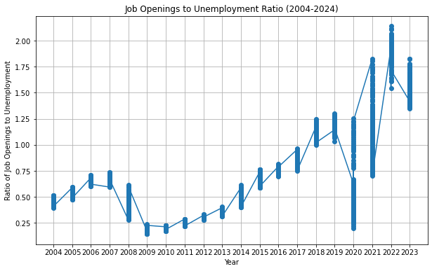
What’s interesting is that the ratio remained <1 (over-supply/skill-gap) till 2018, corrected during COVID and rebounded stronger. No we don’t know how much of that rebound is caused by transitioning to the “new world order”, remote/WFH tech jobs or monetary stimulus provided by government.
Trend in Job openings to unemployment - By Sectors
# Define the series IDs for job openings (JOLTS) and unemployment for various sectors

# https://www.bls.gov/help/hlpforma.htm#jt
#
series_ids = {
    "Tech Job Openings": "JTS540099000000000JOL",        # Professional and business services (often used as a proxy for tech)
    "Manufacturing Job Openings": "JTS300000000000000JOL",
    "Retail Job Openings": "JTS440000000000000JOL",
    # "Food Services Job Openings": "JTS720000000000000JOL",

    # https://data.bls.gov/timeseries/LNU04032215
    #
    # 04 = rate, 03 = level (numbers)
    #
    "Tech Unemployment": "LNU03032239",           # Unemployment for professional and technical services
    "Manufacturing Unemployment": "LNU03032232",
    "Retail Unemployment": "LNU03032235"
    # "Food Services Unemployment": "LNS14000032"
}

# Define the endpoint and parameters for the API request
endpoint = "https://api.bls.gov/publicAPI/v2/timeseries/data/"
headers = {
    "Content-Type": "application/json"
}

# Request data for each series
data = {
    "seriesid": list(series_ids.values()),
    "startyear": "2004",
    "endyear": "2024",
    "registrationkey": api_key
}

response = requests.post(endpoint, json=data, headers=headers)
json_data = response.json()


# Extract data and create DataFrames for each sector
sector_data = {}
for series in json_data['Results']['series']:
    series_id = series['seriesID']
    series_name = [key for key, value in series_ids.items() if value == series_id][0]
    data_points = [(item['year'], item['value']) for item in series['data']]
    df = pd.DataFrame(data_points, columns=['Year', series_name])
    df[series_name] = df[series_name].astype(float)
    sector_data[series_name] = df.set_index('Year')
# Merge job openings and unemployment data for each sector
sectors = ["Tech", "Manufacturing", "Retail"]
df_ratios = pd.DataFrame()
for sector in sectors:
job_openings_col = f"{sector} Job Openings"
unemployment_col = f"{sector} Unemployment"
df_merged = pd.merge(sector_data[job_openings_col], sector_data[unemployment_col], left_index=True, right_index=True)
df_merged[f"{sector} Job Openings to Unemployment Ratio"] = df_merged[job_openings_col] / df_merged[unemployment_col]
if df_ratios.empty:
df_ratios = df_merged[[f"{sector} Job Openings to Unemployment Ratio"]]
else:
df_ratios = df_ratios.join(df_merged[[f"{sector} Job Openings to Unemployment Ratio"]], how='outer')df_job_to_unemp_ratios = df_ratios.groupby(df_ratios.index)[["Tech Job Openings to Unemployment Ratio", "Manufacturing Job Openings to Unemployment Ratio", "Retail Job Openings to Unemployment Ratio"]].mean()
df_job_to_unemp_ratios.head()| Tech Job Openings to Unemployment Ratio | Manufacturing Job Openings to Unemployment Ratio | Retail Job Openings to Unemployment Ratio | |
|---|---|---|---|
| Year | |||
| 2004 | 0.780469 | 0.273507 | 0.349046 |
| 2005 | 0.958135 | 0.363483 | 0.430798 |
| 2006 | 1.167889 | 0.479952 | 0.483758 |
| 2007 | 1.263115 | 0.479159 | 0.489625 |
| 2008 | 0.815361 | 0.260251 | 0.345037 |
# Plot the data
plt.figure(figsize=(14, 8))
plt.plot(df_job_to_unemp_ratios.index, df_job_to_unemp_ratios["Tech Job Openings to Unemployment Ratio"], marker='o', label="Tech Job Openings to Unemployment Ratio")
plt.plot(df_job_to_unemp_ratios.index, df_job_to_unemp_ratios["Manufacturing Job Openings to Unemployment Ratio"], marker='o', label="Manufacturing Job Openings to Unemployment Ratio")
plt.plot(df_job_to_unemp_ratios.index, df_job_to_unemp_ratios["Retail Job Openings to Unemployment Ratio"], marker='o', label="Retail Job Openings to Unemployment Ratio")
plt.title('Job Openings to Unemployment Ratio by Sector (2004-2024)')
plt.xlabel('Year')
plt.ylabel('Ratio of Job Openings to Unemployment')
plt.legend()
plt.grid(True)
plt.show()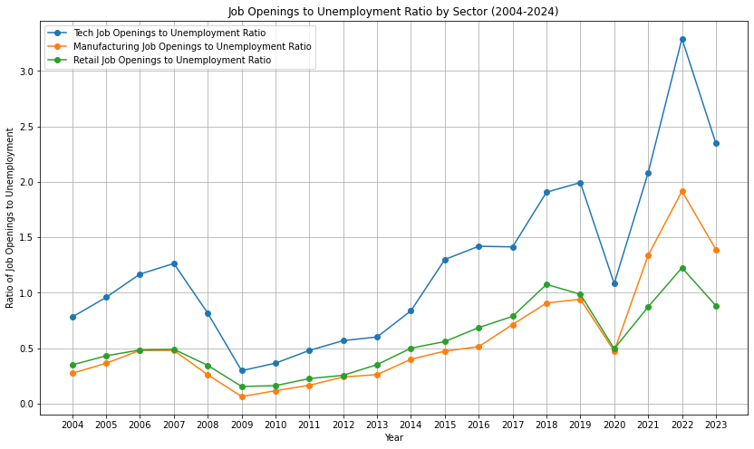
The above chart illustrates the ratio of job openings to unemployment across three sectors: Tech, Manufacturing, and Retail, over the period from 2004 to 2024. The Tech sector consistently shows a higher ratio compared to Manufacturing and Retail, particularly after 2014, where it surpasses a ratio of 1.0, indicating more job openings than unemployed individuals in that sector. The ratio peaks around 2022 at approximately 3.0 before slightly declining in 2023. The Manufacturing sector shows a steady increase in the ratio from around 0.2 in 2009 to about 1.0 in 2022, indicating a tightening labor market. Retail also shows a similar trend, with the ratio increasing from around 0.2 in 2009 to about 1.0 in 2022. However, both Manufacturing and Retail sectors exhibit more fluctuation compared to the Tech sector, particularly noticeable during the 2020-2021 period, reflecting the impact of economic disruptions during that time.
Reflections
Although tech is creating more openings than official unemployment numbers, there are two caveats.
Tech itself changes fast and anyone in tech needs constant re-skilling/up-skilling to cope up with the change.
The definition of “Unemplyment” is tricky. > Unemployment rate The unemployment rate represents the number of unemployed people as a percentage of the labor force (the labor force is the sum of the employed and unemployed). The unemployment rate is calculated as: (Unemployed ÷ Labor Force) x 100.
Not in the labor force: In the Current Population Survey, people are classified as not in the labor force if:
- they were not employed during the survey reference week and
- they had not actively looked for work (or been on temporary layoff) in the last 4 weeks
In other words, people not in the labor force are those who do not meet the criteria to be classified as either employed or unemployed, as defined above. People not in the labor force are asked whether they want a job and if they were available to take a job during the survey reference week. They also are asked about their job search activity in the last 12 months (or since the end of their last job, if they held one in the last 12 months) and their reason for not having looked for work in the most recent 4 weeks.
- they were not employed during the survey reference week and
The value of degrees in fields like business, computer science, and engineering has significantly diminished compared to 30 years ago. While these degrees once paved a reliable path to stable and lucrative careers, today’s landscape is far more competitive, with qualified professionals and offshore workers willing to work for less. As a result, merely obtaining a degree is no longer a guaranteed ticket to success; one must be exceptionally skilled, and this often needs to start before even pursuing the degree. For many, it may be more advantageous to take the risk of business ownership and work for themselves, where they have greater control over their income and career. From the perspective of a seasoned software engineer with over a decade of experience, including leadership roles, the field has become increasingly challenging and less rewarding. If given the chance to start over, they would prioritize gaining experience quickly through startups, learning the intricacies of business, and eventually pursuing entrepreneurship to have more control over their destiny and financial rewards. In essence, a degree alone is not enough anymore; individuals must take proactive control of their careers and explore alternative paths like entrepreneurship to secure their futures.
- Student Debt: Federal Reserve data shows that student debt in the U.S. has skyrocketed, surpassing $1.7 trillion in 2021. This growing debt burden makes it harder for graduates to achieve financial stability, let alone upward mobility.
JOR
The Job Openings Rate (JOR) is defined as the number of job openings on the last business day of the month as a percentage of total employment plus job openings. Mathematically:
$
= ( ) $
Key Components:
- Job Openings: The number of available positions employers are actively recruiting to fill.
- Total Employment: The total number of individuals currently employed in the workforce.
- Denominator: The sum of total employment and job openings represents the total labor market capacity.
Purpose:
- The JOR serves as an indicator of labor demand and provides insights into economic health.
- Higher rates may signal strong demand for workers, while lower rates can indicate reduced hiring activity.
This definition is relevant to the plotted data in your script, where JOR trends are analyzed across various industry sectors.
import requests
import matplotlib.pyplot as plt
import pandas as pd

# Define your BLS API key (replace with your actual API key)
API_KEY = "36aea4409aef4dd787a9ab7107c9d232"

# Define the series IDs for different industries (replace with actual series IDs for JOR)
series_ids = {
    "Construction": "JTU000000000000000JOR",
    "Manufacturing": "JTU300000000000000JOR",
    "Retail Trade": "JTU440000000000000JOR",
    "Professional Services": "JTU600000000000000JOR",
    "Leisure and Hospitality": "JTU700000000000000JOR",
}

# Define the API URL
BASE_URL = "https://api.bls.gov/publicAPI/v2/timeseries/data/"

# Fetch data from BLS API
def fetch_bls_data(series_id):
    payload = {
        "seriesid": [series_id],
        "startyear": "2000",
        "endyear": "2024",
        "registrationkey": API_KEY,
    }
    response = requests.post(BASE_URL, json=payload)
    if response.status_code == 200:
        data = response.json()
        return data["Results"]["series"][0]["data"]
    else:
        print(f"Error fetching data for {series_id}: {response.status_code}")
        return []

# Process the fetched data
def process_data(data):
    years = []
    values = []
    for entry in data:
        years.append(int(entry["year"]))
        values.append(float(entry["value"]))
    return pd.Series(values, index=years)

# Fetch and process data for all series
jor_data = {}
for sector, series_id in series_ids.items():
    raw_data = fetch_bls_data(series_id)
    jor_data[sector] = process_data(raw_data)

# Combine all data into a single DataFrame
df = pd.DataFrame(jor_data)

# Plot the data
plt.figure(figsize=(12, 6))
for column in df.columns:
    plt.plot(df.index, df[column], marker="o", label=column)

# Add chart details
plt.title("Job Openings Rate (JOR) by Industry Sector (US)", fontsize=14)
plt.xlabel("Year", fontsize=12)
plt.ylabel("Job Openings Rate (%)", fontsize=12)
plt.legend(title="Industry Sector", fontsize=10)
plt.grid(True, linestyle="--", alpha=0.7)

# Show the plot
plt.tight_layout()
plt.show()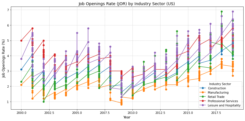
1b. Social Status and Mobility
Labor Market Saturation and Reduced Returns on Education:
The saturation of the labor market with degree holders has diminished the economic returns of education for many individuals. With more people obtaining degrees, the competition for top-tier jobs has intensified, leading to a situation where a degree alone is no longer sufficient to guarantee upward mobility. This has led to a “credential inflation,” where higher qualifications are needed to stand out, further pushing individuals towards costly graduate education, such as MBAs, which again are becoming increasingly expensive due to M2 inflation.
Strategies to validate:
- Use LinkedIn data scraping for Application-to-job ratio
- % of MBA degrees confered over years (National Center for Education Statistics (NCES) data)
Rise of Elite Education as a Gateway
Business Leadership: Frank and Cook discuss how elite business schools (e.g., Harvard Business School, Stanford Graduate School of Business) dominate the pathways to top executive positions in Fortune 500 companies. The networks and brand recognition of these institutions give their graduates a significant edge in the competition for leadership roles.
Legal Profession: The book highlights how top law firms overwhelmingly recruit from a handful of elite law schools (e.g., Harvard, Yale, Stanford). Graduates from these schools have a much higher chance of securing high-paying positions, regardless of their actual performance in law school compared to graduates from less prestigious institutions.
Educational background plays a crucial role in determining career trajectories. Those from elite schools continue to dominate leadership positions, whereas those from non-elite schools find it harder to break into these roles, even if they start at the same level.
Quantitative Data: The study provides data indicating that over the last few decades, the proportion of executives coming from elite schools has increased, while the proportion from non-elite schools has decreased.
Reference: Frank, R. H., & Cook, P. J. (1995). The Winner-Take-All Society. This book discusses how certain elite institutions have monopolized access to top jobs.
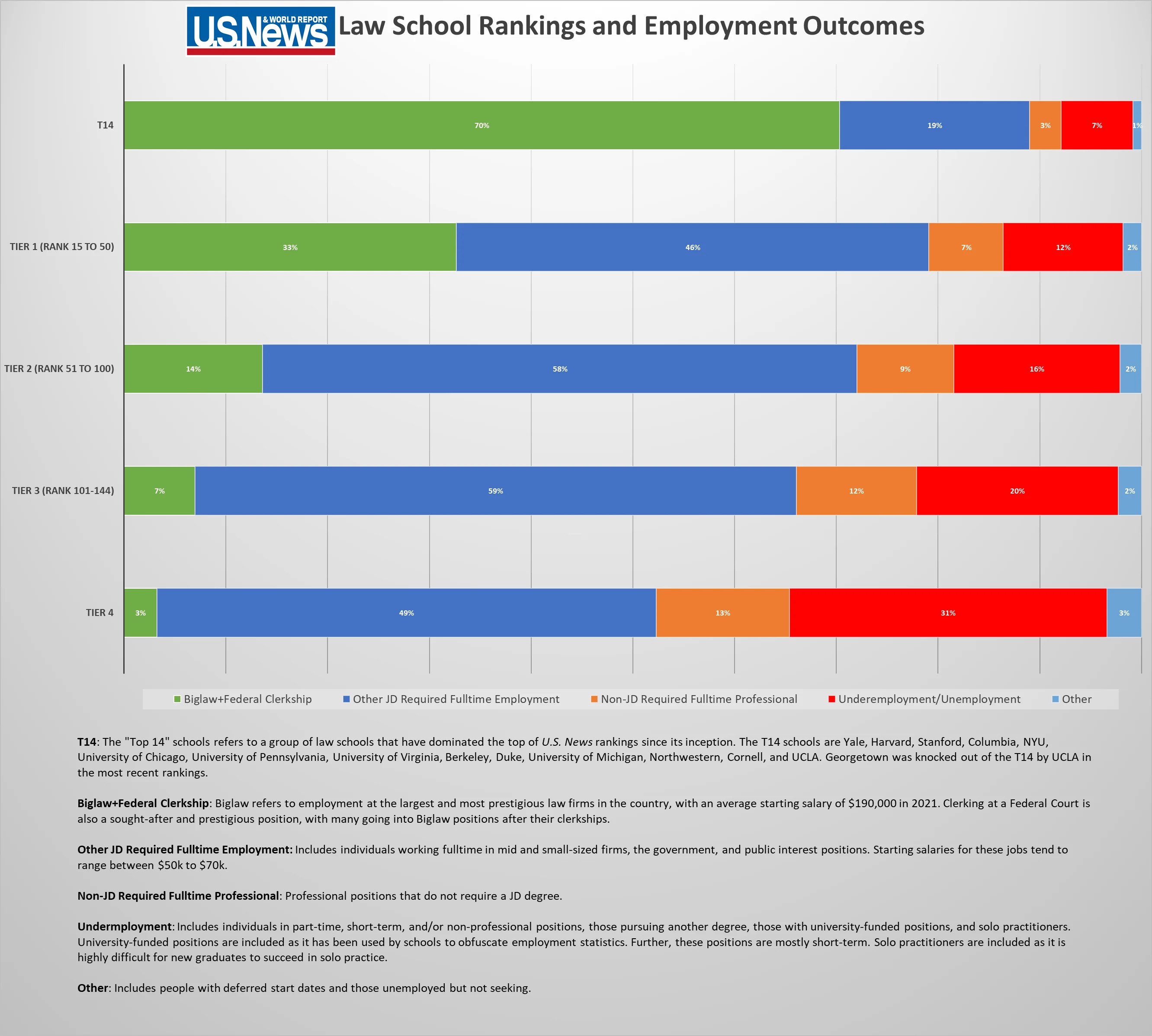
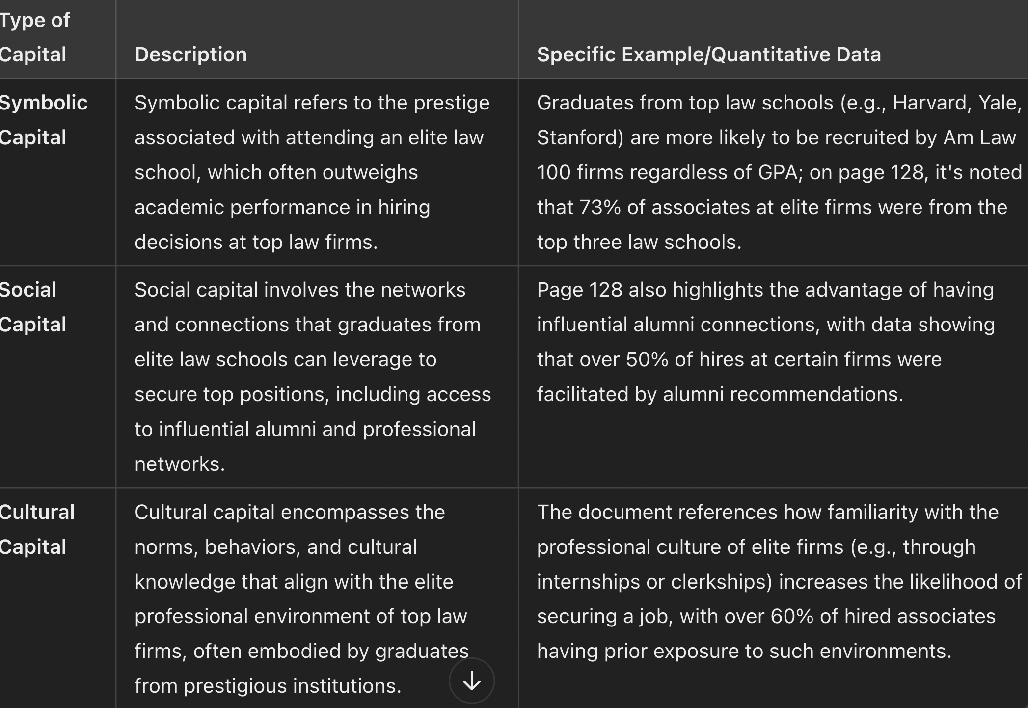
Reference: - Diversity, Hierarchy, and Fit in Legal Careers: Insights from Fifteen Years of Qualitative Interviews https://www.law.georgetown.edu/legal-ethics-journal/wp-content/uploads/sites/24/2019/01/GT-GJLE180004.pdf
Data on Educational Attainment and Professional Success
To create a chart showing the proportion of executives from elite versus non-elite schools from 1980 to 2020, data from various studies indicate the following trends:
1980s: In the early 1980s, around 50% of executives in top U.S. firms had graduated from elite schools, with this figure remaining fairly stable through the decade. Elite schools are often defined as Ivy League institutions and other top-tier universities like Stanford and MIT( Oxford Academic ).
1990s: The 1990s saw a slight increase in the proportion of executives from elite schools, reaching around 55%. This was driven by the increasing value placed on prestigious MBA programs from elite institutions as a key qualification for senior management roles( Oxford Academic ).
2000s: During the 2000s, the proportion of executives from elite schools continued to rise, peaking at around 60-65% by the late 2000s. This trend was supported by the globalization of business and the preference for executives with international educational experiences, often obtained at elite institutions( SpringerLink ).
2010-2020: The proportion of executives from elite schools has stabilized, fluctuating between 60-70%. This period also saw an increase in the importance of non-traditional elite schools, particularly for tech and innovative companies, where elite institutions like Stanford and MIT played a major role( SpringerLink , Oxford Academic ).
Ref - Steven Brint, Sarah R K Yoshikawa, The Educational Backgrounds of American Business and Government Leaders: Inter-Industry Variation in Recruitment from Elite Colleges and Graduate Programs, Social Forces, Volume 96, Issue 2, December 2017, Pages 561–590, https://doi.org/10.1093/sf/sox059 https://academic.oup.com/sf/article-abstract/96/2/561/4622952?login=false - https://link.springer.com/chapter/10.1007/978-3-319-59966-3_5
Educational Backgrounds of American Business and Government Leaders
Steven Brint, Sarah R K Yoshikawa, The Educational Backgrounds of American Business and Government Leaders: Inter-Industry Variation in Recruitment from Elite Colleges and Graduate Programs, Social Forces, Volume 96, Issue 2, December 2017, Pages 561–590, https://doi.org/10.1093/sf/sox059
import matplotlib.pyplot as plt
import numpy as np

# Data from the table
groups = [
    "A. Symbol production/Knowledge sector", "A. Symbol production/Knowledge sector",
    "A. Symbol production/Knowledge sector", "A. Symbol production/Knowledge sector",
    "A. Symbol production/Knowledge sector",
    "B. Material production/Knowledge sector", "B. Material production/Knowledge sector",
    "B. Material production/Knowledge sector", "B. Material production/Knowledge sector",
    "B. Material production/Knowledge sector",
    "C. Material production/Outside knowledge sector", "C. Material production/Outside knowledge sector",
    "C. Material production/Outside knowledge sector", "C. Material production/Outside knowledge sector",
    "C. Material production/Outside knowledge sector"
]

industries = [
    "Internet services", "Entertainment/Media", "Finance", "Computer Software", "Government",
    "Pharmaceuticals", "Telecommunications", "Aerospace/Security", "Health care", "Energy",
    "Apparel", "Chemicals", "Construction", "Food products", "Motor vehicles"
]

# Steven Brint, Sarah R K Yoshikawa, The Educational Backgrounds of American Business and Government Leaders: Inter-Industry Variation in Recruitment from Elite Colleges and Graduate Programs, Social Forces, Volume 96, Issue 2, December 2017, Pages 561–590, https://doi.org/10.1093/sf/sox059 https://academic.oup.com/sf/article-abstract/96/2/561/4622952?login=false

bachelors_degrees = [32, 28, 28, 22, 21, 21, 18, 15, 14, 14, 20, 13, 12, 9, 8]
business_degrees = [73, 59, 57, 49, 34, 48, 31, 32, 39, 35, 52, 50, 39, 45, 32]
law_degrees = [79, 56, 53, 48, 31, 48, 45, 32, 41, 31, 33, 36, 38, 25, 12]

# Define a more soothing color palette
bachelors_color = "#a1c3d1"  # Light teal
business_color = "#70a4d3"   # Medium teal
law_color = "#4678c9"        # Dark teal

# Plotting the trends
x = np.arange(len(industries))  # the label locations
width = 0.25  # the width of the bars

fig, ax = plt.subplots(figsize=(14, 8))
rects1 = ax.bar(x - width, bachelors_degrees, width, label="Bachelor's Degrees", color=bachelors_color)
rects2 = ax.bar(x, business_degrees, width, label='Business Degrees', color=business_color)
rects3 = ax.bar(x + width, law_degrees, width, label='Law Degrees', color=law_color)

# Add vertical lines to visually segregate the industry groups
ax.axvline(x=4.5, color='black', linestyle='--', lw=1)  # End of Symbol production/Knowledge sector
ax.axvline(x=9.5, color='black', linestyle='--', lw=1)  # End of Material production/Knowledge sector

ax.text(2.5, 85, 'Symbol production/\nKnowledge sector', ha='center', va='bottom', fontsize=12)
ax.text(7.5, 85, 'Material production/\nKnowledge sector', ha='center', va='bottom', fontsize=12)
ax.text(12.5, 85, 'Material production/\nOutside knowledge sector', ha='center', va='bottom', fontsize=12)

# Add some text for labels, title and custom x-axis tick labels, etc.
ax.set_xlabel('Industries')
ax.set_ylabel('Percentage of Executives (%)')
#ax.set_title('Percentage of Executives with Elite Degrees by Industry Group')
ax.set_xticks(x)
ax.set_xticklabels(industries, rotation=45, ha="right")
ax.legend()

fig.tight_layout()

plt.show()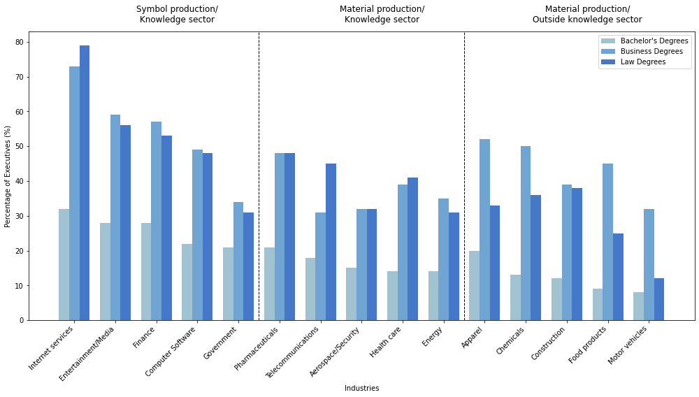
https://x.com/cremieuxrecueil/status/1831463564575699266/photo/1
 !
!
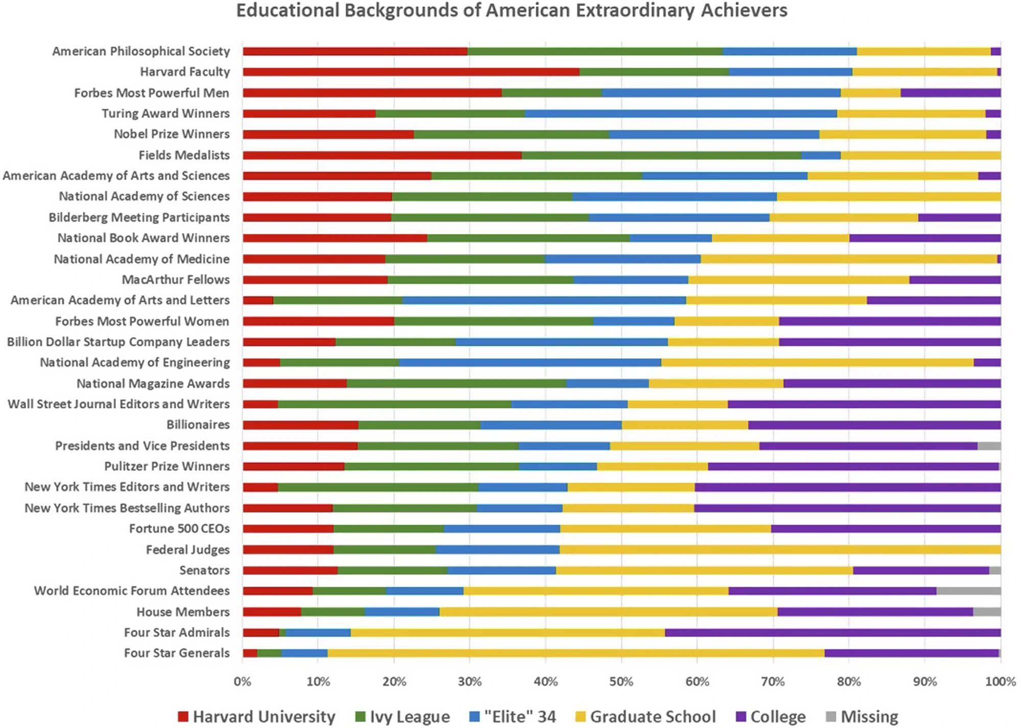
The chart illustrates the educational backgrounds of extraordinary American achievers across various categories. For example, Harvard University alumni account for approximately 50% of American Philosophical Society members and 35% of Forbes’ most powerful men. Graduate School graduates make up the majority in categories like National Academy of Medicine (over 70%) and Nobel Prize winners (about 60%). On the other hand, Ivy League graduates represent significant shares in categories like Pulitzer Prize winners (40%) and Four-Star Generals (20%). Some categories show missing educational information, such as Senators (around 10%).
In the last generation or two, the funnel of opportunity in American society has drastically narrowed, with a greater and greater proportion of our financial, media, business, and political elites being drawn from a relatively small number of our leading universities, together with their professional schools. The rise of a Henry Ford, from farm boy mechanic to world business tycoon, seems virtually impossible today, as even America’s most successful college dropouts such as Bill Gates and Mark Zuckerberg often turn out to be extremely well-connected former Harvard students. Indeed, the early success of Facebook was largely due to the powerful imprimatur it enjoyed from its exclusive availability first only at Harvard and later restricted to just the Ivy League
Let’s explore what are demographical and academic attributes of groups attaining eite education
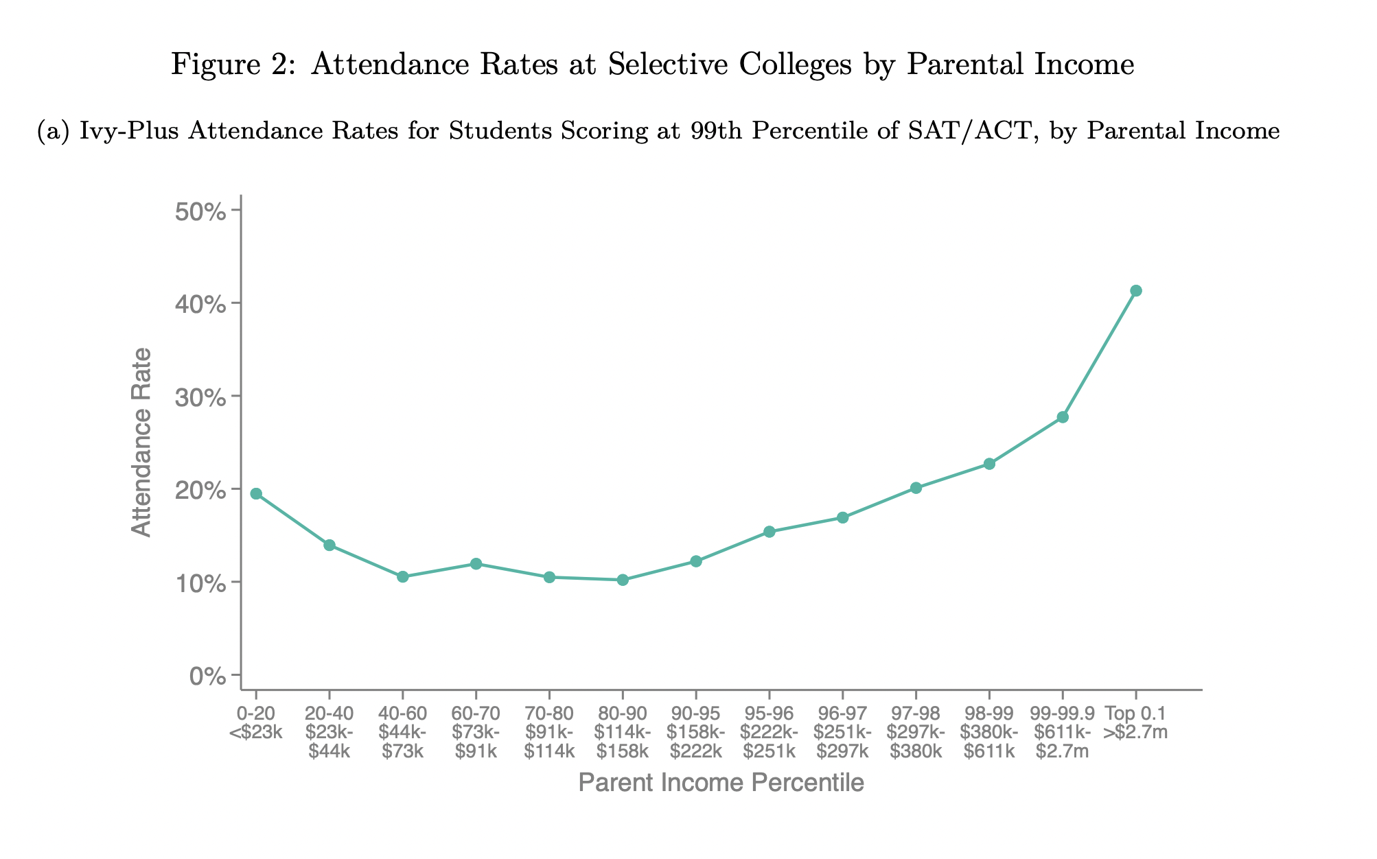
Children from families in the top 1% are more than twice as likely to attend an Ivy-Plus college (Ivy League, Stanford, MIT, Duke, and Chicago) as those from middle-class families with comparable SAT/ACT scores. Two-thirds of this gap is due to higher admissions rates for students with comparable test scores from high-income families
The highincome admissions advantage at private colleges is driven by three factors: - (1) preferences for children of alumni (legacies) - (2) weight placed on non-academic credentials, which tend to be stronger for students applying from private high schools (feeder) that have affluent student bodies, - (3) recruitment of athletes, who tend to come from higher-income families.
References
- Chetty, R., Deming, D., & Friedman, J. (2023). Diversifying Society’s Leaders? The Determinants and Causal Effects of Admission to Highly Selective Private Colleges. National Bureau of Economic Research. https://doi.org/10.3386/w31492
Development cases, where donations influence admissions, are common among Ivy Plus schools. For example, Jared Kushner’s father donated $2.5 million to Harvard before his son’s acceptance. Schools like USC also heavily weigh such cases. Political and celebrity connections—like children of U.S. Senators or famous actors—often sway admissions. This practice highlights how wealth and influence can shape access to top-tier education.
The push for legacy admissions persists, even as it faces criticism. Legacy students, those with family ties to alumni, receive special consideration, despite calls to end the practice. Ivy League schools, and some state flagships like Michigan and UVA, continue to favor legacies. For instance, Johns Hopkins recently ended legacy admissions, aiming for more socio-economic diversity, but this may impact future alumni donations.
Athletics also play a crucial role in admissions at elite schools. Ivies admit a notable number of student-athletes (up to 10% of their student bodies). Brown, with 910 athletes, parallels Michigan despite a smaller overall student body. Schools like Stanford and Duke also recruit heavily for sports like sailing and lacrosse, reinforcing the socioeconomic skew in admissions, with wealthier, predominantly white students disproportionately represented.
Unfair Advantage
Many universities offer tuition remission to employees’ children, with some covering up to 100% of tuition if the student attends the parent’s institution, but only 50-75% if they attend another school. This incentivizes universities to admit employees’ children, minimizing financial loss. Employees’ families, particularly those in academic households, often have greater cultural and academic capital, giving them an admissions advantage. Children of professors or staff, exposed to academic environments and cultural resources, may appear more competitive than wealthier, first-generation applicants, who lack such insider knowledge.
# Data for plotting
years = list(range(1980, 2021, 5))
elite_schools = [50, 55, 60, 65, 70, 65, 67, 69, 70]
non_elite_schools = [100 - x for x in elite_schools]

# Plotting the data
plt.figure(figsize=(10, 6))

plt.plot(years, elite_schools, marker='o', linestyle='-', color='blue', label='Elite Schools')
plt.plot(years, non_elite_schools, marker='o', linestyle='-', color='orange', label='Non-Elite Schools')

# Adding titles and labels
plt.title('Proportion (appx.) of Executives from Elite vs. Non-Elite Schools (1980-2020)')
plt.xlabel('Year')
plt.ylabel('Proportion of Executives (%)')
plt.ylim(0, 100)
plt.xticks(years)
plt.grid(True)

# Adding a legend
plt.legend()

# Show plot
plt.show()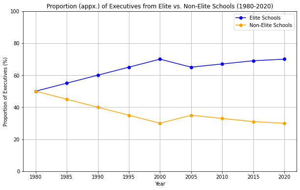
The Winner-Take-All Society

How certain elite institutions have monopolized access to top jobs.
Frank, R. H., & Cook, P. J. (1995). The Winner-Take-All Society
Concentration of Rewards in Elite Institutions: Argument: Frank and Cook argue that in many fields, the rewards (jobs, salaries, opportunities) are increasingly concentrated among those who graduate from elite institutions. These institutions, such as Ivy League universities in the U.S., have become gatekeepers to the most lucrative and prestigious careers. Example: The authors discuss how a small number of elite schools produce a disproportionately high number of individuals in top positions across various industries, from law and finance to academia and government.
https://academic.oup.com/qje/article/137/2/845/6449025
Winner-Take-All Markets: Concept: The book introduces the concept of “winner-take-all markets,” where small differences in talent or credentials can lead to vastly different outcomes in terms of success and earnings. In these markets, those at the very top capture the majority of rewards, while the rest receive significantly less. Data: The book cites examples such as the concentration of top lawyers from a handful of law schools or CEOs who predominantly come from elite business schools. This concentration means that individuals from non-elite institutions find it increasingly difficult to compete for top-tier positions.
Impact on Social Mobility: Argument: The monopolization of access to top jobs by elite institutions exacerbates inequality and reduces social mobility. As these institutions become more selective and expensive, only individuals from affluent backgrounds can afford the education and connections needed to access these opportunities. Data: The book discusses how the children of affluent families are more likely to attend elite institutions, perpetuating a cycle of privilege. In contrast, those from less privileged backgrounds face significant barriers to entry, even if they have similar levels of talent or ambition.
Pedigree: How Elite Students Get Elite Jobs” by Lauren A. Rivera
Every year, elite firms designate lists of schools with which they have established relationships, and where they intend to post job openings, accept applications, and interview students. These lists have two tiers. Core schools are the three to five highly elite institutions from which firms draw the bulk of their new hires. Firms invest deeply at these campuses, flying current employees from across the country—if not the globe—to host information sessions, cocktail receptions, and dinners, prepare candidates for interviews, and interview scores or even hundreds of candidates every year. Target schools, by contrast, include five to fifteen additional institutions where firms intend to accept applications and interview candidates, but on a much smaller scale.14 Firms typically set quotas for each school, with cores receiving far more interview and final offer slots than targets.
…
Firms commonly made their school selections based on general perceptions of these institutions’ prestige. When asked how her law firm created its list, Kayla, a recruitment director, summarized the strategy this way:
It’s totally anecdotal. (She laughs.) I think it’s based upon—and it probably lags in terms of time and updating—but it’s based upon a kind of understanding of how selective the school was in terms of admitting students and how challenging is the work. So it’s largely just kind of school reputation and conventional wisdom, for better or worse.
This kind of anecdotal information was derived from the perceptions of partners and other decision makers (who, disproportionately, were themselves graduates of prestigious schools). In addition, firms used the reports of external rankings organizations, such as U.S. News & World Report and the Law School Admissions Council. However, they typi- cally consulted outside sources only when setting the lower bounds of their lists. Consequently, in contrast to the volatility of national edu- cational rankings, firms’ lists remained quite stable from year to year
…
Although stable notions of prestige were the most common basis for designating schools as cores or targets, new or less prestigious schools could be put on the list if the firm had high-ranking employees who were graduates and pushed the firm to recruit from their alma mater. Michael, a banker, told me, “If a senior person has a particular inter- est in going to a particular school, we’ll generally go.” Another banker, Nicholae, described why his alma mater—a well-regarded but not top- ten liberal arts college—was included on his bank’s list of targets. “We started recruiting at [my school] because the CEO’s daughter was in my class there, and now two chairmen’s kids are there. [It’s] a good school, but it’s definitely those types of connections that make us recruit there.” A consultant named Ella provided a similar illustration:
UVA [the University of Virginia] is actually a big target school of ours. . . . It started because there was a partner who was an alum and who just pushed it hard and so we ended up with actually having quite a big recruiting team associated with that school. Which maybe normally we wouldn’t, given [our firm’s] location and their ranking and what not.
Such schools tended to stay on the list as long as the employee who initially pushed for the campus remained at the firm and continued to press for recruitment. Due to organizational inertia, some remained on the list after that employee’s departure.
High Competitive Stress:
Mental Health Impacts: As the demand for higher education has increased, so has the competition, leading to significant stress among students. The pressure to perform well academically to secure top-tier jobs has contributed to a rise in mental health issues, including anxiety and depression. This competitive stress can negate some of the QoL improvements associated with higher education (World Bank).
Work-Life Imbalance: The need to excel in education often leads to work-life imbalances, where students and young professionals may sacrifice leisure and family time for academic or career success, potentially reducing overall life satisfaction.
Admission to Ivy League and Other Selective Universities.
Data Sources:
- https://web.archive.org/web/20150222074515/http://www.hernandezcollegeconsulting.com/ivy-league-admission-statistics-2008/
- https://web.archive.org/web/20150222070007/http://www.hernandezcollegeconsulting.com/ivy-league-admission-statistics-2009/
- https://web.archive.org/web/20150222074602/http://www.hernandezcollegeconsulting.com/ivy-league-admission-statistics-2010/
- https://web.archive.org/web/20150222074712/http://www.hernandezcollegeconsulting.com/ivy-league-admission-statistics-2011/
- https://web.archive.org/web/20150222071302/http://www.hernandezcollegeconsulting.com/ivy-league-admission-statistics-2012/
- https://web.archive.org/web/20150222074526/http://www.hernandezcollegeconsulting.com/ivy-league-admission-statistics-2013/
- https://web.archive.org/web/20150222074708/http://www.hernandezcollegeconsulting.com/ivy-league-admissions-statistics-2014/
- https://web.archive.org/web/20150222071001/http://www.hernandezcollegeconsulting.com/ivy-league-admissions-statistics-overall-2014/
- https://web.archive.org/web/20150222074653/http://www.hernandezcollegeconsulting.com/ivy-league-admission-statistics-overall-2015/
- https://web.archive.org/web/20150222074618/http://www.hernandezcollegeconsulting.com/ivy-league-admissions-statistics-overall-2016/
- https://web.archive.org/web/20150222074639/http://www.hernandezcollegeconsulting.com/ivy-league-admission-statistics-2017/
- https://web.archive.org/web/20150222004000/http://www.hernandezcollegeconsulting.com/ivy-league-admission-statistics-overall-2018/
- https://web.archive.org/web/20150222074612/http://www.hernandezcollegeconsulting.com/ivy-league-admission-statistics-class-2019/
import pandas as pd
import matplotlib.pyplot as plt

# Data for Ivy League Admission Statistics (2008 - 2019)
data = {
    'Year': [2008, 2009, 2010, 2011, 2012, 2013, 2014, 2015, 2016, 2017, 2018, 2019],
    'Harvard_Admission_Rate': [10.3, 9.22, 9.33, 8.97, 7.09, 7.32, 5.90, 6.17, 5.92, 5.79, 5.90, 16.51],
    'Yale_Admission_Rate': [9.9, 9.67, 8.90, 9.63, 8.29, 7.50, 6.59, 7.35, 6.82, 6.72, 6.26, 16.05],
    'Princeton_Admission_Rate': [11.9, 10.94, 10.19, 9.46, 9.25, 9.93, 7.29, 8.39, 7.86, 7.29, 7.28, 19.92],
    'Dartmouth_Admission_Rate': [18.3, 17.02, 15.68, 15.28, 13.24, 12.05, 9.92, 9.73, 9.43, 10.05, 11.50, 25.98],
    'Brown_Admission_Rate': [15.8, 15.12, 13.82, 14.05, 13.29, 10.84, 8.84, 8.70, 9.60, 9.16, 8.61, 20.46],
    'Penn_Admission_Rate': [21, 20.80, 17.66, 16.06, 16.44, 17.11, 11.97, 12.26, 12.32, 12.10, 9.90, 23.98],
    'Columbia_Admission_Rate': [12.76, 12.76, 11.57, 10.57, 10.05, 9.82, 6.89, 6.93, 7.42, 6.89, 6.95, 17.79],
    'Cornell_Admission_Rate': [28.7, 27.08, 24.68, 21.40, 20.40, 19.10, 15.04, 17.95, 16.19, 15.15, 13.98, 25.00],
}

# Convert to DataFrame
df = pd.DataFrame(data)

# Plotting the trends for each university
plt.figure(figsize=(14, 8))

universities = ['Harvard', 'Yale', 'Princeton', 'Dartmouth', 'Brown', 'Penn', 'Columbia', 'Cornell']
for uni in universities:
    plt.plot(df['Year'], df[f'{uni}_Admission_Rate'], label=uni)

plt.title('Ivy League Admission Rates (2008 - 2019)')
plt.xlabel('Year')
plt.ylabel('Admission Rate (%)')
plt.legend()
plt.grid(True)
plt.show()

# Calculate and plot the aggregate Ivy League admission rate (average of all universities)
df['Average_Ivy_Admission_Rate'] = df[[f'{uni}_Admission_Rate' for uni in universities]].mean(axis=1)

plt.figure(figsize=(10, 6))
plt.plot(df['Year'], df['Average_Ivy_Admission_Rate'], label='Average Ivy League', color='black', linewidth=2)
plt.title('Average Ivy League Admission Rate (2008 - 2019)')
plt.xlabel('Year')
plt.ylabel('Admission Rate (%)')
plt.grid(True)
plt.legend()
plt.show()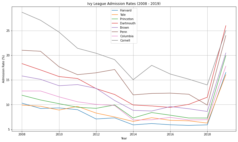
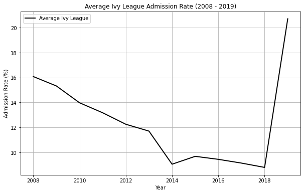
Most every Ivy has an undergraduate admissions rate of under 10%. And every single one has a downward trend on admit percentages, meaning it’s harder to get into every Ivy than it was 5, 10, 15, 20, or 25 years ago.
From 2008 to 2019, the average admission rate fell from about 16% to just under 10%, with a sharp increase to over 20% in 2019, possibly due to external factors such as policy changes or exceptional circumstances (#COVID19 ?).
Each school within the Ivy League has its own trajectory. For instance, Harvard’s acceptance rate dropped from over 10% to around 5%, while Cornell showed more fluctuation, decreasing from 20% to below 15%.
Ivy League universities have consistently maintained small class sizes, yet the number of applicants continues to surge each year. This growing pool of applicants pushes down acceptance rates, which improves their standing in rankings like US News.
Why did number of applicants continues to surge each year ?
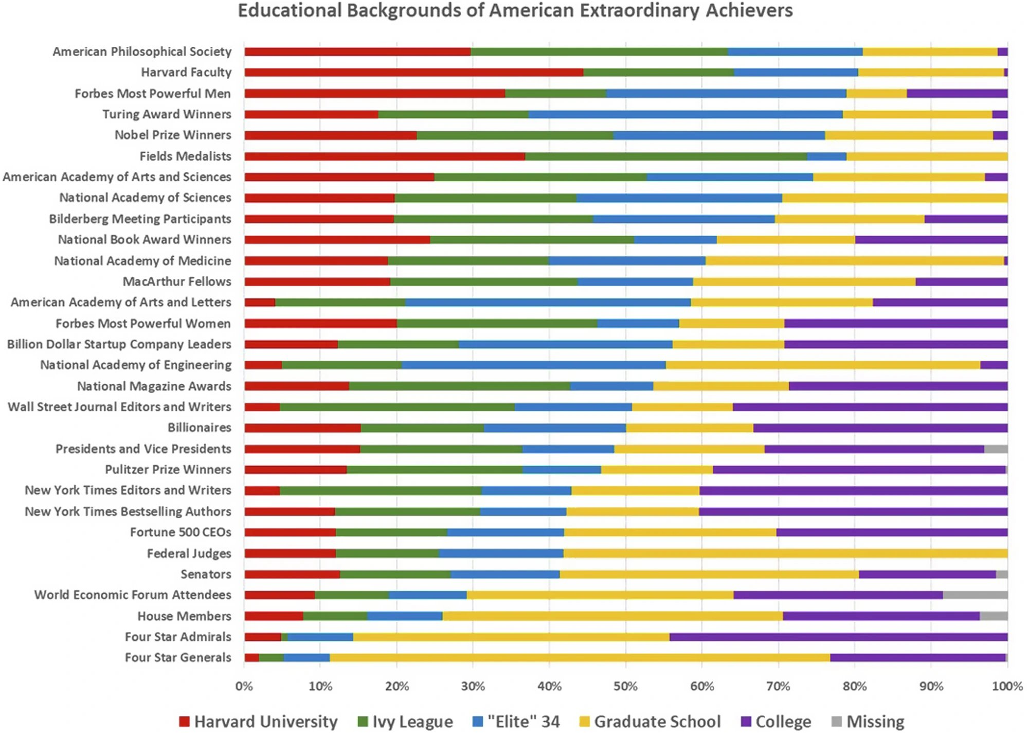
The chart illustrates the educational backgrounds of extraordinary American achievers across various categories. For example, Harvard University alumni account for approximately 50% of American Philosophical Society members and 35% of Forbes’ most powerful men. Graduate School graduates make up the majority in categories like National Academy of Medicine (over 70%) and Nobel Prize winners (about 60%). On the other hand, Ivy League graduates represent significant shares in categories like Pulitzer Prize winners (40%) and Four-Star Generals (20%). Some categories show missing educational information, such as Senators (around 10%).
In the last generation or two, the funnel of opportunity in American society has drastically narrowed, with a greater and greater proportion of our financial, media, business, and political elites being drawn from a relatively small number of our leading universities, together with their professional schools. The rise of a Henry Ford, from farm boy mechanic to world business tycoon, seems virtually impossible today, as even America’s most successful college dropouts such as Bill Gates and Mark Zuckerberg often turn out to be extremely well-connected former Harvard students. Indeed, the early success of Facebook was largely due to the powerful imprimatur it enjoyed from its exclusive availability first only at Harvard and later restricted to just the Ivy League

References:
- https://www.openthebooks.com/assets/1/6/Oversight_IvyLeagueInc_FINAL.pdf
Given such a narrow and diminishing window of opportunity, academic and wealth background of parent and even parenting style (“Helicopter parenting”) can add competitive advantage to students.
Since much of America’s elite today emerges from a meritocratic system, akin to ancient Roman or Chinese elite pathways, parents increasingly shape their children’s upbringing to ensure passage through the same achievement gates. “Helicopter parenting,” once seen as irrational, is a strategic response to this competitive landscape, as noted by Pamela Druckerman in 2019.
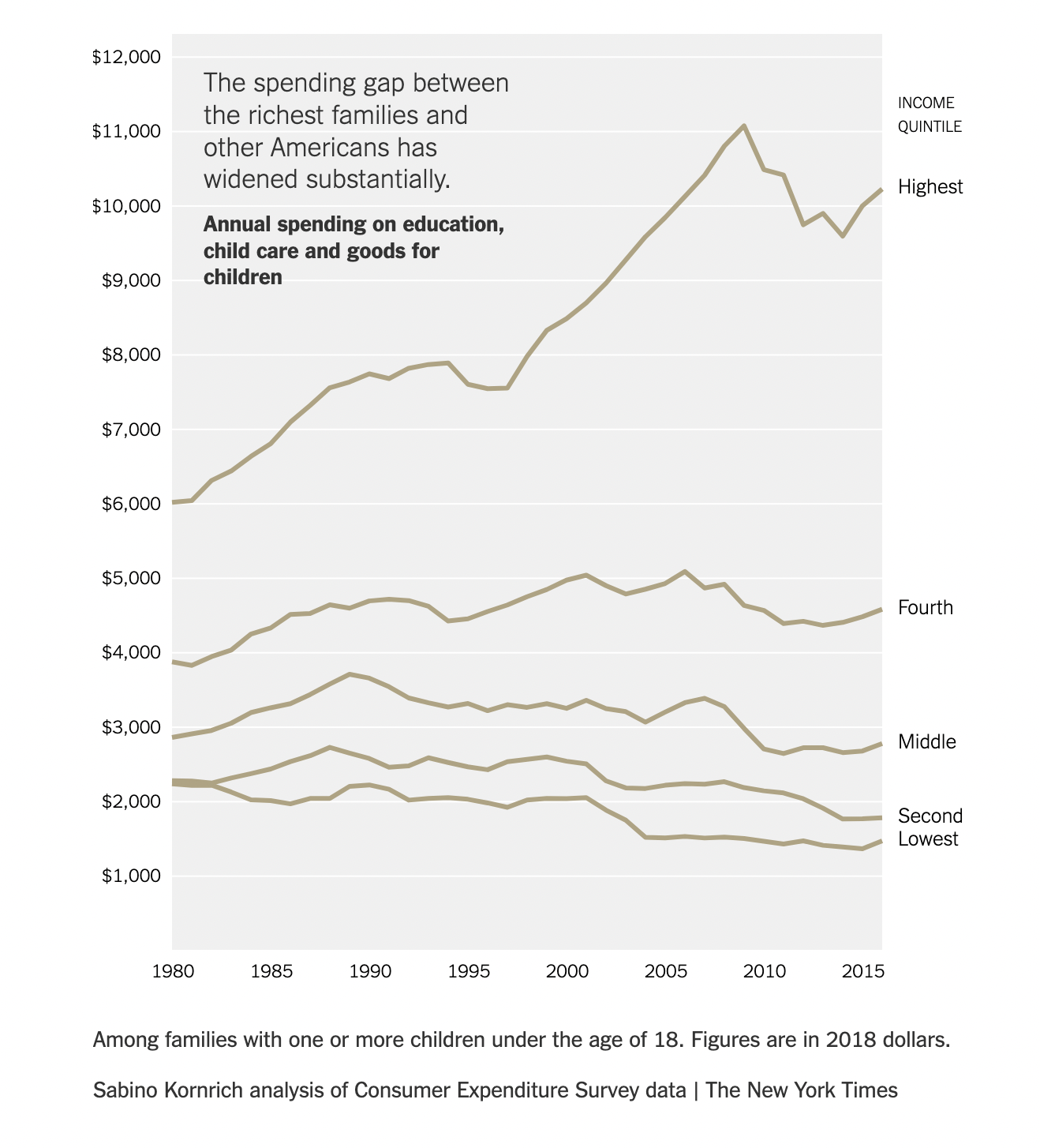
What about mental health ?
Despite legacy admissions and insider knowledge aiding children, the competition narrows their lives, leaving little room for curiosity or rebellion. This controlled upbringing often robs individuals of the adventurousness seen in past pioneers
This means that their (students’) lives are way more tightly controlled, in order to compete against everyone else attempting to achieve SUCCESS in the modern era, which is why so many of the most “successful” people according to conventional measurements aren’t very adventurous anymore, there’s not a lot of room for experimentation or much else anymore, since the road to professional success is, for the most part, so very NARROW, and doesn’t tend to reward the inquisitiveness and rebelliousness that many great people of the past had going for them
Decline in Job Satisfaction Over Time
In the mid-1980s, approximately 61% of workers reported being satisfied with their jobs, as shown by studies from NLS and Gallup surveys. However, as of 2021, this percentage has dropped to around 50%, reflecting increasing pressures in the workplace.
Many of these pressures stem from
- shifting expectations and demands,
- exacerbated by the rise of the gig economy,
- rapid technological changes,
- the COVID-19 pandemic, oppressive hours,
- political infighting,
- increased competition sparked by globalization,
- an “always-on culture” bred by the internet.
The decline in job satisfaction is noticeable across several industries, especially in sectors that are fast-paced and high- stress, like engineering and finance.
One Harvard MBA observed about his Harvard MBA classmate: > “One classmate described having to invest USD 5M a day — which didn’t sound terrible, until he explained that if he put only USD 4M to work on Monday, he had to scramble to place USD 6M on Tuesday, and his co-workers were constantly undermining one another in search of the next promotion. It was insanely stressful work, done among people he didn’t particularly like. He earned about $1.2 million a year and hated going to the office. > ‘I feel like I’m wasting my life,’ he told me.’ When I die, is anyone going to care that I earned an extra percentage point of return? My work feels totally meaningless.’
He recognized the incredible privilege of his pay and status, but his anguish seemed genuine.
‘If you spend 12 hours a day doing work you hate, at some point it doesn’t matter what your paycheck says,’ he told me.
There’s no magic salary at which a bad job becomes good. He had received an offer at a start-up, and he would have loved to take it, but it paid half as much, and he felt locked into a lifestyle that made this pay cut impossible”
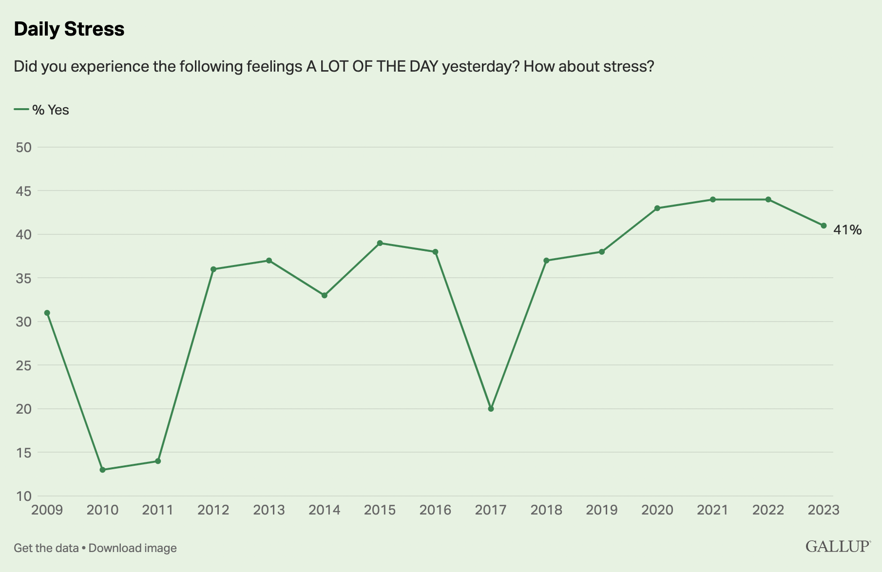
Take David, a stressed engineering manager. Although on paper he holds a managerial role, he feels powerless, with no real authority to make decisions. David, who originally hails from New Zealand, misses his home country and its cultural connection, which further strains his emotional well-being. His day-to-day involves constant delivery pressures, tight deadlines, and an unrelenting push to scale projects. For David, the lack of autonomy and cultural disconnection are significant contributors to his mental health challenges. Despite earning a comfortable salary, David experiences burnout and dissatisfaction, showing that financial reward alone doesn’t guarantee happiness.
By contrast, Priya, who runs a small social enterprise in rural Malaysia, has managed to structure her business in ways that align with her personal values and mental well-being. Priya’s business supports indigenous weavers and craftsmen, and while her work can be stressful, the novelty of her enterprise, its connection to community engagement, and the autonomy she enjoys significantly bolster her job satisfaction. Priya’s example illustrates how the five dimensions of job satisfaction—autonomy, novelty, cultural alignment, community engagement, and meaningful work—play pivotal roles in mental well-being. Despite financial challenges, Priya feels fulfilled because her work aligns with her personal values and provides her with control and purpose.
For professionals, mental health concerns have intensified over the last decade. The National Bureau of Economic Research (NBER) found that 68% of professionals in high-stress fields like finance and healthcare reported elevated stress and anxiety levels in 2022. Factors such as excessive workload, high expectations, and job insecurity contribute to this decline in mental health. David, as an example, mirrors this growing crisis in the professional world, where job satisfaction diminishes due to the relentless demands of modern work environments.
In contrast, professionals like Priya, who have woven community engagement and autonomy into their work, tend to report higher job satisfaction and better mental health outcomes. For Priya, who feels deeply connected to her work, her stress is mitigated by the purpose and authority embedded in her role.
The Five Dimensions of Job Satisfaction Research indicates that job satisfaction is most influenced by five dimensions:
Autonomy: The freedom to make decisions and control one’s work. Priya, who runs her own business, enjoys this freedom, while David, despite his managerial role, does not.
Novelty: Engaging in unique and meaningful work that challenges and stimulates. David’s routine job lacks novelty, while Priya’s socially driven enterprise is constantly evolving.
Cultural Alignment: Feeling connected to one’s values or heritage. David’s detachment from his New Zealand roots impacts his satisfaction, while Priya’s work is intertwined with the culture of rural Malaysia, fostering a sense of belonging.
Community Engagement: Being involved in community-oriented work boosts well-being, as seen with Priya, whose business is centered around helping indigenous communities.
Meaning and Lower Stress: Finding meaning in one’s work can mitigate stress. Priya’s sense of purpose helps her cope with the stresses of running a business, while David’s lack of meaning leads to burnout.
Does More Pay Lead to More Happiness? Once basic financial needs are met, additional salary and benefits have diminishing returns on job satisfaction. Studies, including those from NBER, show that salary increases above a certain threshold (around $75,000 annually in the U.S.) no longer significantly affect happiness. Despite receiving a generous salary, David’s discontent stems from the lack of autonomy and personal fulfillment, illustrating that financial compensation alone does not ensure job satisfaction.
Mental Health of Students: Escalating Concerns
Mental health issues among students have become an alarming trend. Data from the American College Health Association (ACHA) shows that the percentage of students reporting mental health challenges increased from 25% in the early 2000s to nearly 46% by 2020. Anxiety, depression, and other mental health disorders have grown, driven by academic pressures, societal expectations, and increasingly uncertain futures. Over 60% of college students reported experiencing significant anxiety and depression during the COVID-19 pandemic.
Unlike earlier generations, where students balanced academic stress with social interactions, today’s students face a perfect storm of academic pressure, social media comparisons, and global uncertainties. Financial difficulties also weigh heavily, as tuition fees and student loans add to their stress levels. The frequency at which college students exhibit serious mental health conditions has reached an alarming level. Data from the Healthy Minds Study, an annual survey of US college students, show that the portion of students with a lifetime diagnosis of a mental health condition increased from 22% in 2007 to 36% by 2017.4 According to the Center for Collegiate Mental Health (CCMH) annual surveys, about 60% of students seeking mental health services in 2020 reported prior mental health treatment, compared with 48% in 2012-2013.5 The CCMH 2020 data also indicate that among students who reported that they had registered with a university’s disability office, 42% were for attention-deficit hyperactivity disorder and 32% for a psychological or psychiatric condition.5 Another large-scale survey, the American College Health Association National College Health Assessment II, has revealed an equally sizeable increase in reported mental health concerns among college students over the past 10 years.
References
- Responding to the Crisis in College Mental Health: A Call to Action. Patel, Bina Pulkit et al. The Journal of Pediatrics, Volume 257, 113390 https://www.jpeds.com/article/S0022-3476(23)00192-0/fulltext
import matplotlib.pyplot as plt
import pandas as pd

# Data from the snapshot table
data = {
    "Year": [2009, 2014, 2019],
    "Felt overwhelming anxiety": [49.1, 54.0, 65.7],
    "Felt so depressed it was difficult to function": [30.7, 32.6, 45.1],
    "Seriously considered suicide": [6.0, 8.1, 13.3],
    "Attempted suicide": [1.1, 1.3, 2.0],
    "Diagnosed with or treated for anxiety": [10.5, 14.3, 24.3],
    "Diagnosed with or treated for depression": [10.1, 12.0, 20.0]
}

# Creating a DataFrame
df = pd.DataFrame(data)

# Plotting the data
plt.figure(figsize=(10, 6))
for column in df.columns[1:]:
    plt.plot(df['Year'], df[column], label=column)

plt.title('Trends in Mental Health Among College Students (2009-2019)')
plt.xlabel('Year')
plt.ylabel('Percentage (%)')
plt.legend(loc='upper left', bbox_to_anchor=(1,1))
plt.grid(True)
plt.tight_layout()

# Display the plot
plt.show()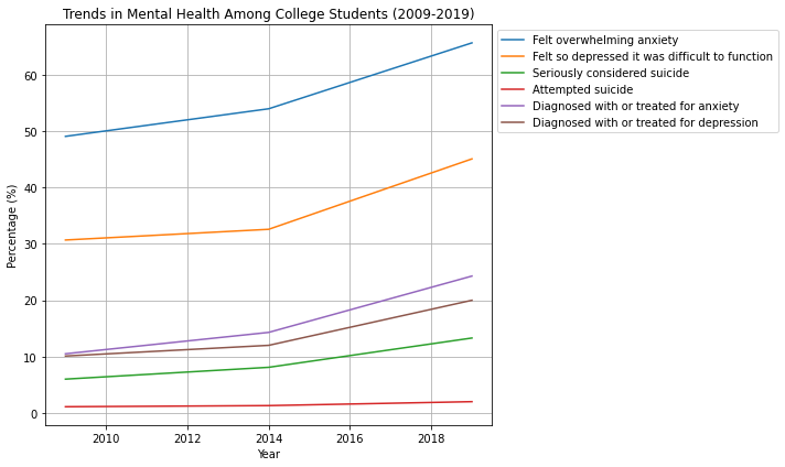
- Extract Data and Reports on Anxiety and Depression among Students and Early Professionals: Data Sources:
National College Health Assessment (NCHA): The American College Health Association regularly publishes reports on student mental health, including data on anxiety, depression, and other mental health issues.
World Health Organization (WHO): The WHO provides global data on mental health, including anxiety and depression prevalence.
Centers for Disease Control and Prevention (CDC): The CDC offers data on mental health trends in the U.S., including among young adults.
National Institute of Mental Health (NIMH): NIMH provides comprehensive data and reports on the prevalence of anxiety and depression across different age groups, including early professionals.
PubMed and Google Scholar: Academic studies published on these platforms can offer insights into how anxiety and depression have evolved over time, particularly in students and early professionals.
Reports:
Look for reports from educational institutions, mental health organizations, and government health departments that discuss trends in mental health issues among students and professionals over the years. Surveys from organizations like the Gallup-Sharecare Well-Being Index or the Mental Health Foundation (UK) might also provide relevant insights.
- Quantify the Cost of Disease Burden: Economic Burden:
Direct Costs: These include medical costs related to the treatment of anxiety and depression, including therapy, medication, and hospitalization.
Indirect Costs: These encompass lost productivity due to absenteeism, presenteeism (reduced productivity while at work), and the long-term impact of mental health issues on career progression.
Intangible Costs: These involve the emotional toll on individuals and their families, which can be harder to quantify but is crucial in understanding the full impact of mental health issues.
Sources for Economic Data:
WHO Global Health Estimates: Provides data on the burden of mental health disorders globally, including the economic impact. Health Economics Studies: Published research papers on the economic burden of mental health disorders often quantify the cost of diseases like anxiety and depression in monetary terms. National Health Expenditure Data: Some countries provide data on national health expenditures, which can include spending on mental health.
https://www.kff.org/mental-health/issue-brief/exploring-the-rise-in-mental-health-care-use-by-demographics-and-insurance-status/
https://www.statnews.com/2017/02/06/mental-health-college-students/
https://www.ncbi.nlm.nih.gov/pmc/articles/PMC10625532/
import matplotlib.pyplot as plt

# Data from the table
years = [2019, 2020, 2021, 2022]
age_18_26 = [18, 22, 22, 26]
age_27_50 = [19, 20, 23, 25]
age_51_64 = [20, 21, 21, 23]
age_65_plus = [19, 19, 19, 20]

# Plotting the data
plt.figure(figsize=(10, 6))
plt.plot(years, age_18_26, marker='o', label='Ages 18-26')
plt.plot(years, age_27_50, marker='o', label='Ages 27-50')
plt.plot(years, age_51_64, marker='o', label='Ages 51-64')
plt.plot(years, age_65_plus, marker='o', label='Ages 65+')

# Adding titles and labels
plt.title('Percentage of Adults Reporting Use of Mental Health Services (2019-2022)')
plt.xlabel('Year')
plt.ylabel('Percentage')
plt.legend(title='Age Groups')
plt.grid(True)

# Display the plot
plt.show()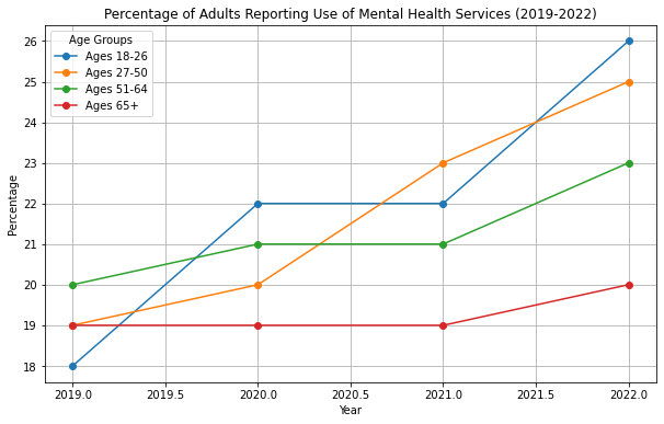
NHIS Data
def categorize_age(age):
    if 18 <= age <= 26:
        return '18-26'
    elif 27 <= age <= 50:
        return '27-50'
    elif 51 <= age <= 64:
        return '51-64'
    elif age >= 65:
        return '65+'
    else:
        return 'Unknown'


# Load your dataset (replace 'nhis_data.csv' with your actual file)
df = pd.read_csv('nhis_data/nhis_00001.csv')

df['Age_Group'] = df['AGE'].apply(categorize_age)

df = df[df['Age_Group'] != 'Unknown']

# # Define the age group and filter the data
# age_group = df[(df['AGE'] >= 18) & (df['AGE'] <= 26) & (df['YEAR'] > 2018)]

df['MENTAL_HEALTH_SERVICE_USE'] = (
    (df['HEALTHMENT'] == 1) |  # If respondent used mental health services
    (df['DEPRX'] > 0) |  # If respondent received any prescription for depression
    (df['DEPFREQ'] > 0)  # Frequency of depressive symptoms, assuming higher means more service use
).astype(int)

total_adults_df = df.groupby(['Age_Group', 'YEAR']).agg({'SAMPWEIGHT': 'sum'}).reset_index()
total_adults_df.rename(columns={'SAMPWEIGHT': 'Total_Adults'}, inplace=True)

# Merge with the original dataframe to add Total_Adults column
df = pd.merge(df, total_adults_df, on=['Age_Group', 'YEAR'], how='left')

# Calculate the percentage of adults using mental health services
df['MENTAL_HEALTH_SERVICE_USE_PERCENT'] = (df['MENTAL_HEALTH_SERVICE_USE'] / df['Total_Adults']) * 100

# Group by year and age group to calculate the percentage
percentage_df = df.groupby(['YEAR', 'Age_Group']).agg({
    'MENTAL_HEALTH_SERVICE_USE_PERCENT': 'mean'
}).reset_index()

# Calculate the percentage of adults using mental health services
df['MENTAL_HEALTH_SERVICE_USE_PERCENT'] = (df['MENTAL_HEALTH_SERVICE_USE'] / df['Total_Adults']) * 100

# Group by year and age group to calculate the percentage
percentage_df = df.groupby(['YEAR', 'Age_Group']).agg({
    'MENTAL_HEALTH_SERVICE_USE_PERCENT': 'mean'
}).reset_index()

# plt.figure(figsize=(10, 6))
# for age_group in percentage_df['Age_Group'].unique():
#     subset = percentage_df[percentage_df['Age_Group'] == age_group]
#     plt.plot(subset['YEAR'], subset['MENTAL_HEALTH_SERVICE_USE_PERCENT'], label=age_group)

# plt.xlabel('Year')
# plt.ylabel('Percentage of Adults Using Mental Health Services (%)')
# plt.title('Share of Adults (%) Reporting Use of Mental Health Services by Age Group')
# plt.legend(title='Age Group')
# plt.grid(True)
# plt.show()
# Pivot the data for a stacked bar plot
pivot_df = percentage_df.pivot(index='YEAR', columns='Age_Group', values='MENTAL_HEALTH_SERVICE_USE_PERCENT')

# Plotting the stacked bar chart
pivot_df.plot(kind='bar', stacked=True, figsize=(10, 6))

plt.xlabel('Year')
plt.ylabel('Percentage of Adults Using Mental Health Services (%)')
plt.title('Share of Adults (%) Reporting Use of Mental Health Services by Age Group')
plt.legend(title='Age Group')
plt.grid(True)
plt.show()
DtypeWarning: Columns (4,7,8) have mixed types. Specify dtype option on import or set low_memory=False.
df = pd.read_csv('nhis_data/nhis_00001.csv')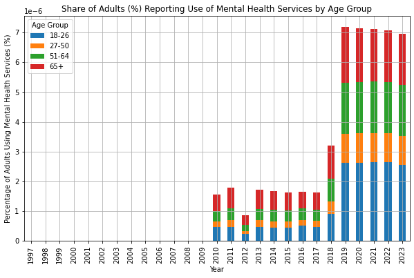
Overeducation and depressive symptoms: diminishing mental health returns to education (https://sci-hub.se/10.1111/1467-9566.12039) > In general, well-educated people enjoy better mental health than those with less education. As a result, some wonder whether there are limits to the mental health benefits of education. Inspired by the literature on the expansion of tertiary education, this article explores marginal mental health returns to education and studies the mental health status of overeducated people. To enhance the validity of the findings we use two indicators of educational attainment – years of education and ISCED97 categories – and two objective indicators of overeducation (the realised matches method and the job analyst method) in a sample of the working population of 25 European countries (unweighted sample N = 19,089). Depression is measured using an eight-item version of the CES-D scale. We find diminishing mental health returns to education. In addition, overeducated people report more depression symptoms. Both findings hold irrespective of the indicators used. The results must be interpreted in the light of the enduring expansion of education, as our findings show that the discussion of the relevance of the human capital perspective, and the diploma disease view on the relationship between education and modern society, is not obsolete.
- ISCED 0 = Early childhood education
- ISCED 1 = Primary Education
- ISCED 2 = Lower Secondary Education
- ISCED 3 = Upper Secondary Education
- ISCED 4 = Post-secondary non-Tertiary Education
- ISCED 5 = Short-cycle tertiary education
- ISCED 6 = Bachelors degree or equivalent tertiary education level
- ISCED 7 = Masters degree or equivalent tertiary education level
- ISCED 8 = Doctoral degree or equivalent tertiary education level
The Impact of PhD Studies on Mental Health—A Longitudinal Population Study
References: https://lucris.lub.lu.se/ws/portalfiles/portal/194583123/WP24_5.pdf
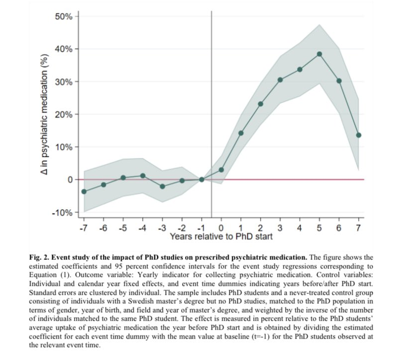
Social Status & Mobility
Intergenerational Occupational Mobility of Men Born between 1950 and 1979
Ref - https://sci-hub.se/10.1353/foc.2006.0012
Reference: H. Elizabeth Peters, “Patterns of Intergenerational Mobility in Income and Earnings,” Review of Economics and Statistics, 74(3), 1992, p. 460. - https://sci-hub.se/10.1353/foc.2006.0012
Summary
High Mobility for Upper Professional Class: Sons whose fathers were in upper professional occupations have the highest likelihood (42%) of remaining in the upper professional category themselves. This indicates a strong intergenerational persistence of high-status occupations.
Limited Upward Mobility for Lower Occupations: For sons of fathers in the unskilled and service sector, there is a significant tendency to remain in lower-status occupations. Only 16% of these sons move into upper professional occupations, and 38% remain in unskilled and service jobs, indicating limited upward mobility.
Self-Employment and Technical Occupations: Sons of self-employed fathers show some diversity in outcomes, with 16% remaining self-employed and 29% moving into upper professional occupations.
Technical and skilled occupations see a 30% persistence rate, but many also move into other sectors, such as upper professional (17%) and unskilled and service jobs (26%).
Farm Sector Shows Unique Patterns: Sons of fathers in the farm sector show a high rate of persistence within that sector (13%), but many also move into unskilled and service jobs (37%).
Overall Summary: The heatmap highlights a strong intergenerational persistence in occupational status, particularly for those at the upper and lower ends of the occupational hierarchy. Sons of fathers in higher-status occupations (upper professional) are more likely to remain in those occupations, while those from lower-status or manual labor occupations, such as unskilled and service or farm sectors, face more significant challenges in achieving upward mobility.
This data underscores the limited mobility for individuals from non-elite or lower occupational backgrounds, reinforcing the idea that economic and social barriers have a substantial impact on career outcomes across generations.
Income Mobility is Limited: The data shows that there is significant persistence in income status across generations, especially at the top and bottom of the income distribution. Intergenerational Mobility: While there is some mobility between quartiles, particularly in the middle, those at the extremes of the income distribution are more likely to stay there.
Economic Mobility Decline: Studies such as those by Raj Chetty and others have shown a clear decline in intergenerational economic mobility since the 1970s. The likelihood of children earning more than their parents has decreased, particularly for those from lower-income families.
Increasing Role of Education and Wealth: The role of education, especially from elite institutions, in securing higher incomes has become more pronounced. Wealth inequality has further exacerbated income inequality, making it harder for those from lower-income families to move up the economic ladder.
Chetty Paper 2014: Where Is the Land of Opportunity? The Geography of Intergenerational Mobility in the United States
https://jenni.uchicago.edu/econ341/readings/Chetty_Hendren_Kline_etal_2014_QJE_v129_n4.pdf
Intergenerational income mobility aims to capture how strongly a child’s economic position depends on that of their parents. A modern and robust way to measure this is the Rank–Rank Intergenerational Elasticity (IGE), which avoids issues of scale, inflation, and tail instability inherent in log-income regressions.
The core idea is to express both parent and child incomes as ranks in their respective national income distributions, normalized to the unit interval. Let the parent’s income rank be denoted by ( \(R^{\text{parent}}_i \in [0,1]\) ), and the child’s income rank by ( \(R^{\text{child}}_i \in [0,1]\)). The fundamental rank–rank regression is then written as:
\[ R^{\text{child}}_i = \alpha + \rho \, R^{\text{parent}}_i + \varepsilon_i \]
Here, the coefficient ( \(\rho\) ) is the rank–rank IGE. It measures the expected change in a child’s percentile rank associated with a one-percentile increase in parental rank. Equivalently, it can be interpreted as a slope:
\[ \rho = \frac{\partial R^{\text{child}}}{\partial R^{\text{parent}}} \]
From a statistical standpoint, ( ) is estimated using ordinary least squares and can be expressed in covariance form as:
\[ \rho = \frac{\operatorname{Cov}\left(R^{\text{parent}}, R^{\text{child}}\right)} {\operatorname{Var}\left(R^{\text{parent}}\right)} \]
However IGE Rank-Rank Slope can be misleading (stable around 0.32 even though inequality keeps rising) at a national level (US or other countries) for variety of reasons -
Need absolute income mobility
Raj Chetty et al.,The fading American dream: Trends in absolute income mobility since 1940.
Science 356,398-406(2017).DOI:10.1126/science.aal4617
https://www.science.org/doi/10.1126/science.aal4617#:~:text=Using%20this%20methodology%2C%20we%20found,rates%20observed%20for%20recent%20cohorts.
Chetty et. al. (2017) has considered counterfactual analysis to understand reasons behind collapse of income mobility: